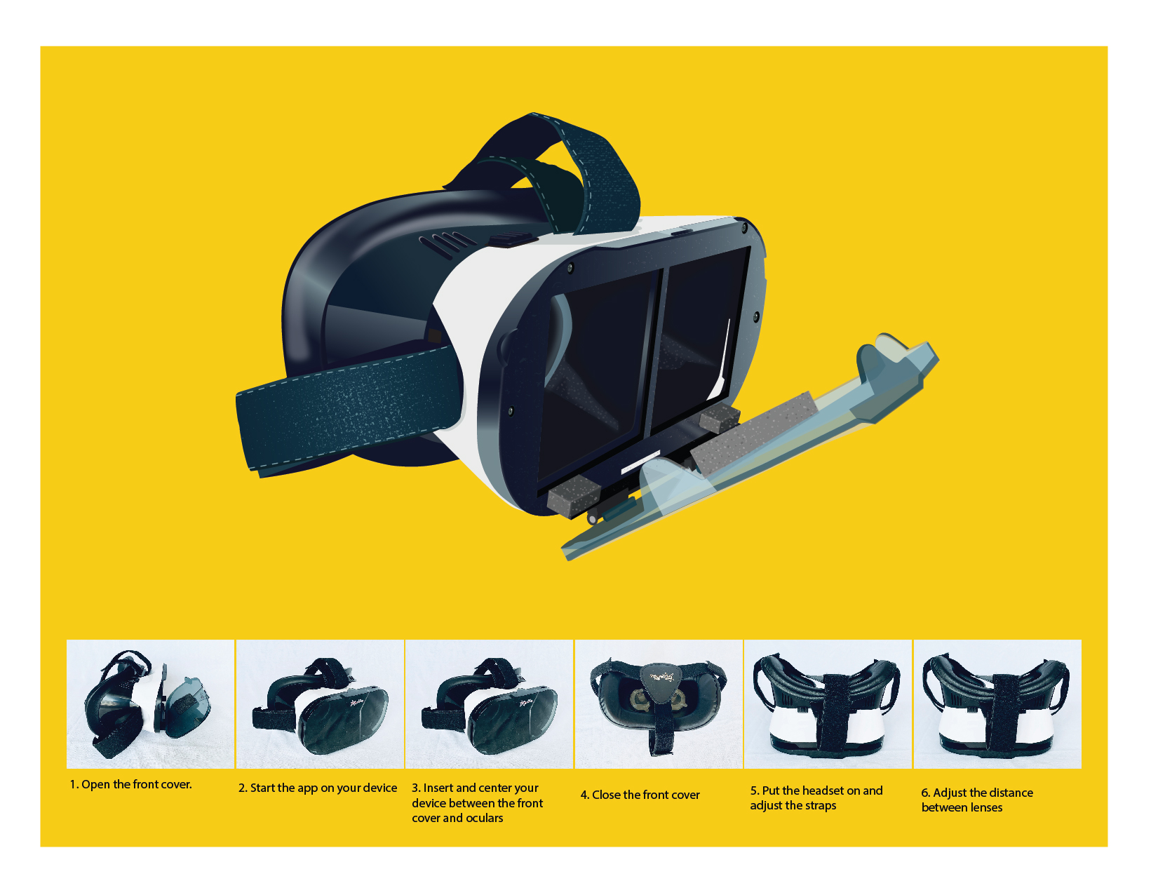
For my final design I came back to the yellow background. I decided that doing gender based design is not fair to girls and women. I opted for colors that everybody would enjoy.
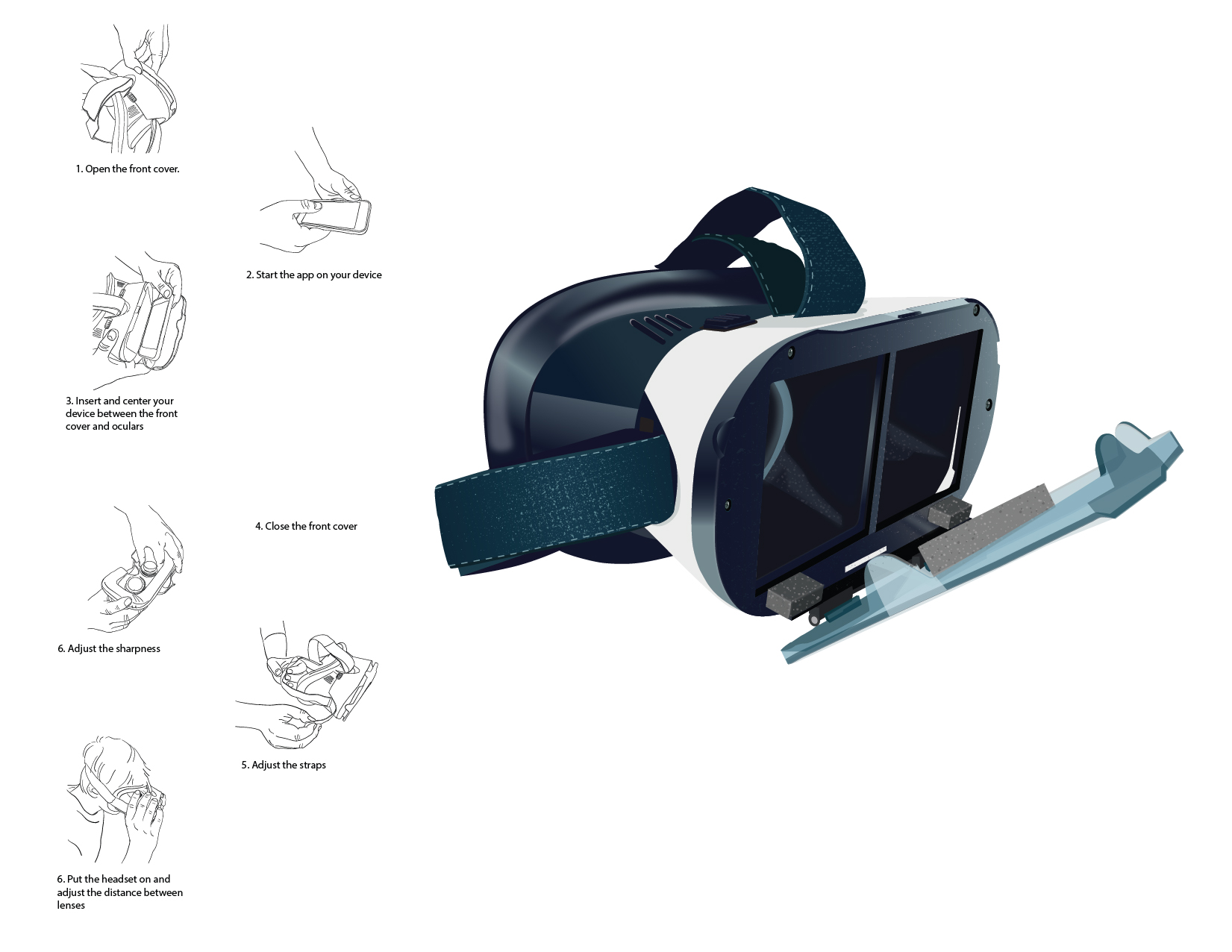
The users are young adults. Young adults deal with a lot of changes and their life is very stressful. There’s fast paced work environment, climate changes, long commute to work and many more. They need something to be able to relax. Virtual reality glasses can offer little bit of escape from everyday life even during their long commute to work.
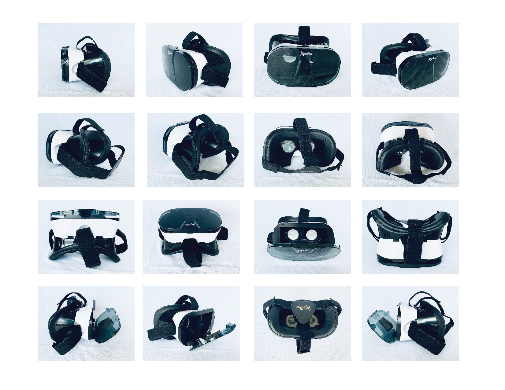
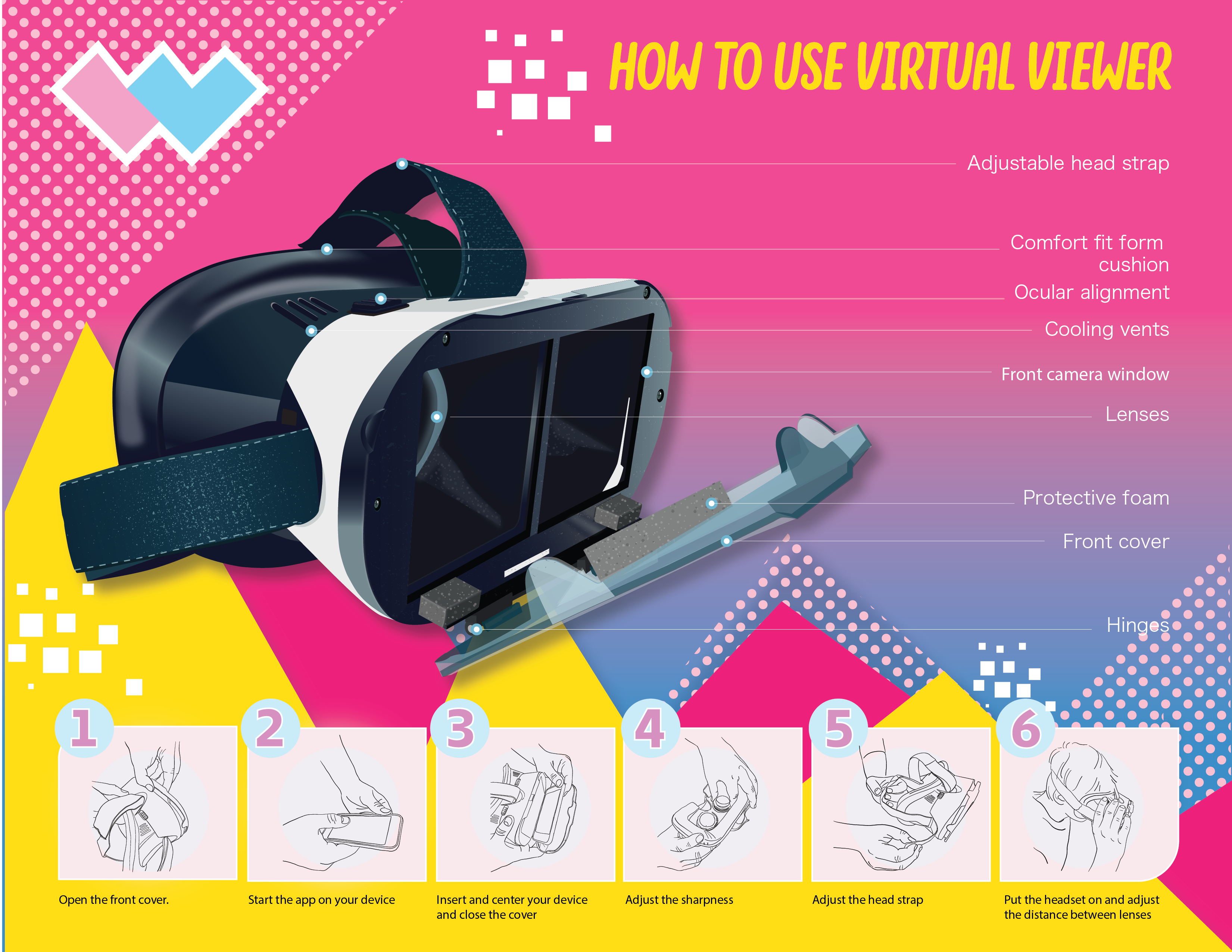
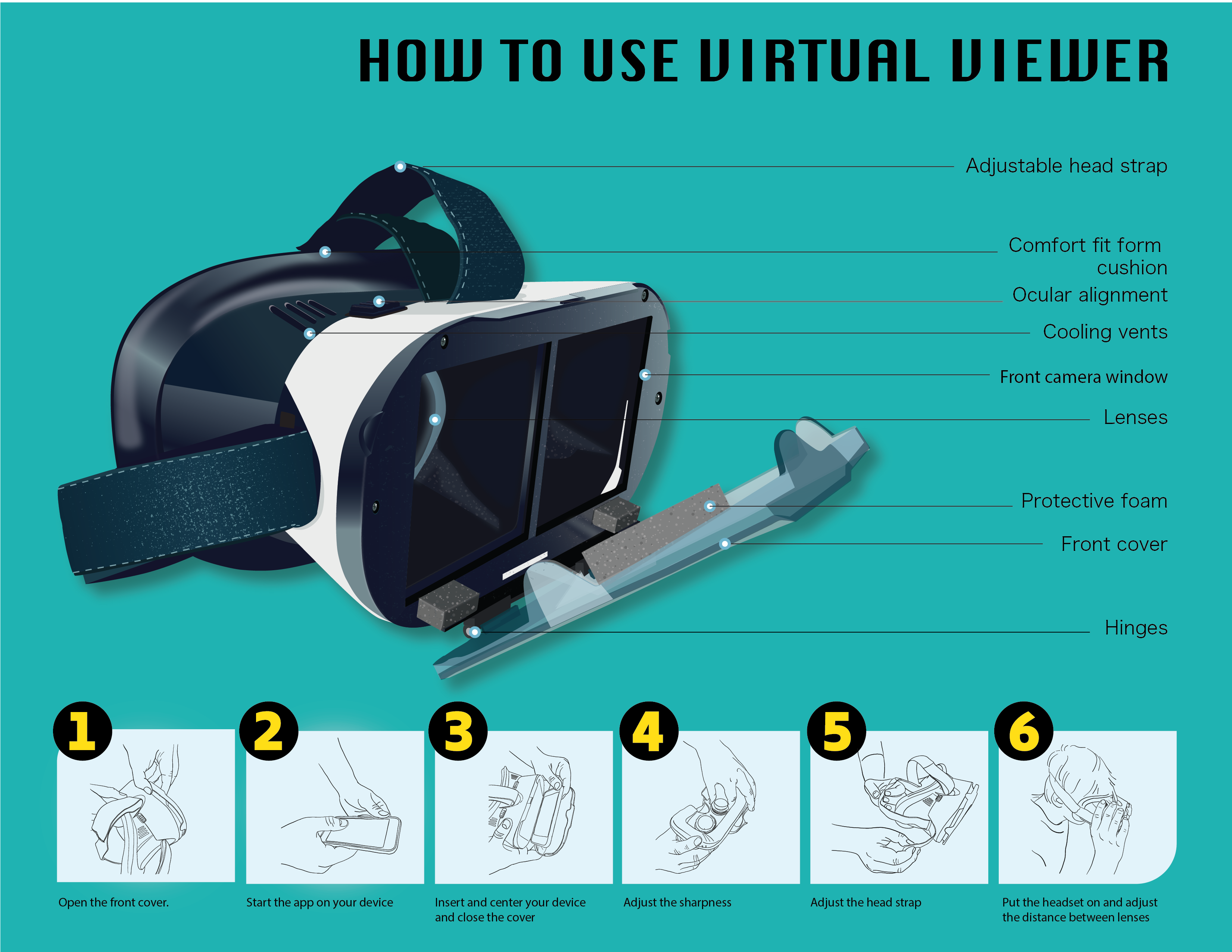
I took many photos of my product and labeled the one that I thought has the best angle.
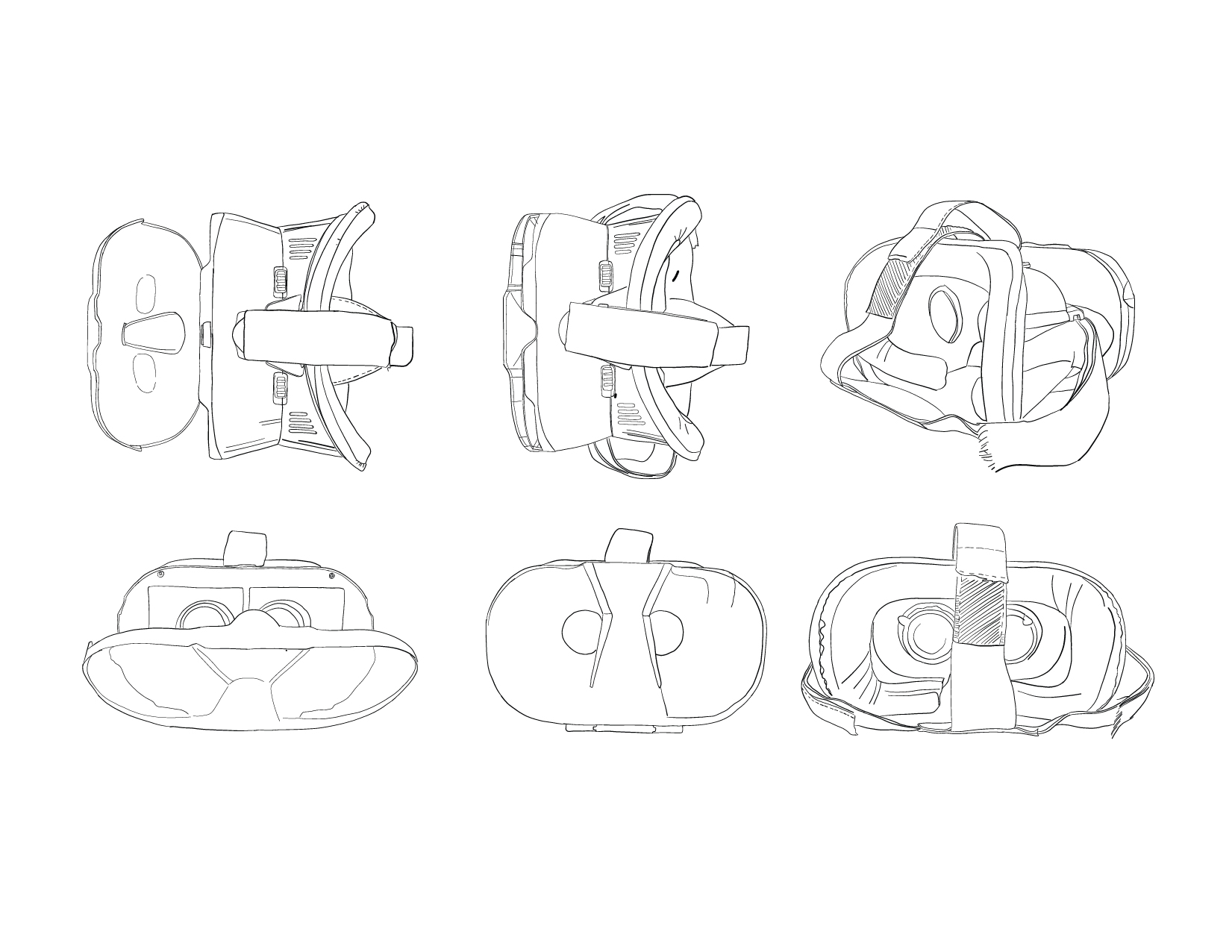
Here are the vector sketches of some of my favourite angles.
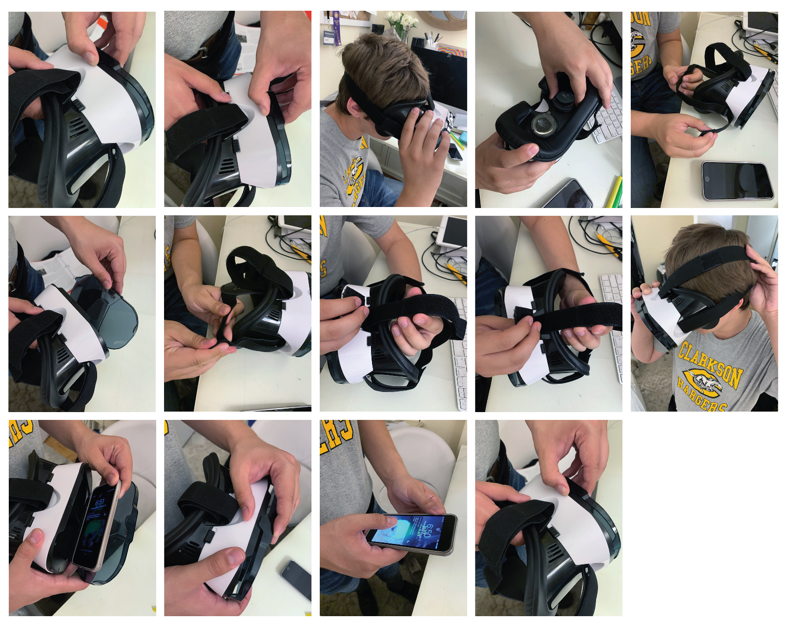
Photos of the product and the person interacting with the product. I tried to take as many as possible to be able later to trace them on my ipad.
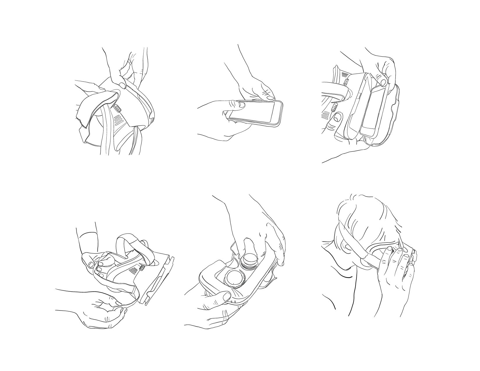
Traced photos.
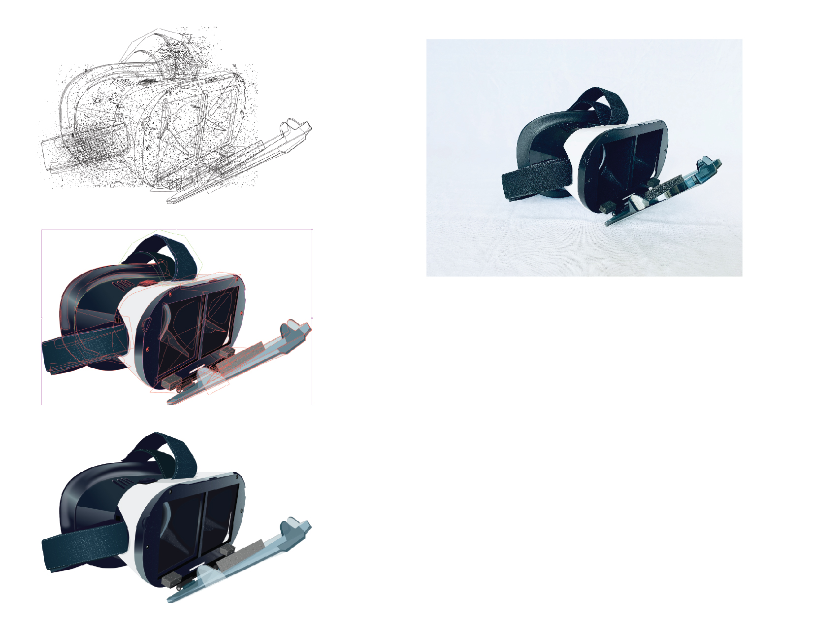
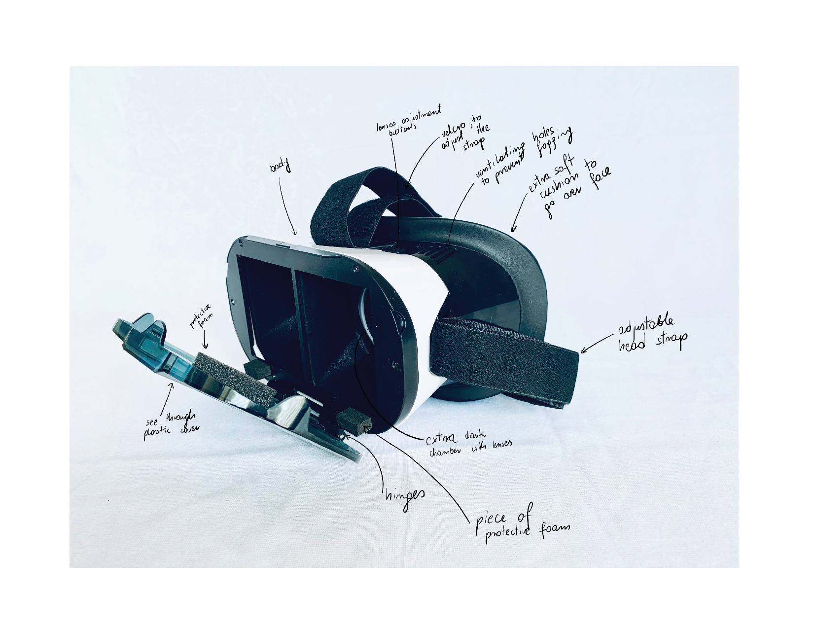
The picture on the right is the original product photo. On the left there is model drawn in Adobe Illustrator. First picture shows outline mode selected, second – bounding box around all selected parts, third – the finished drawing.
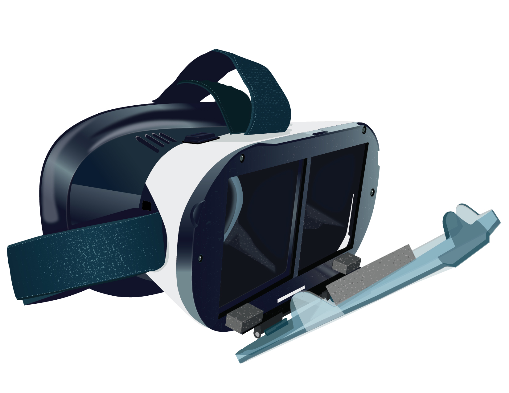
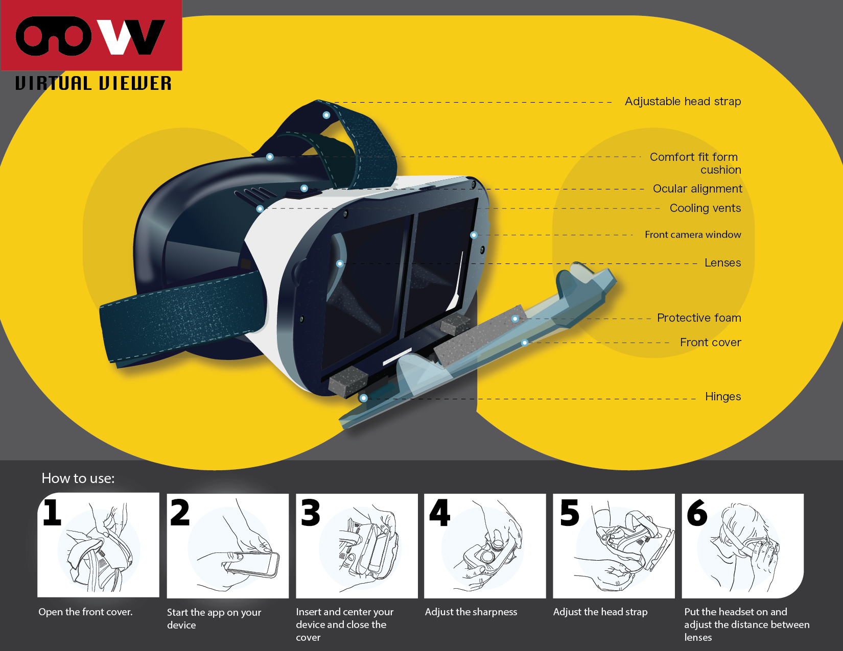
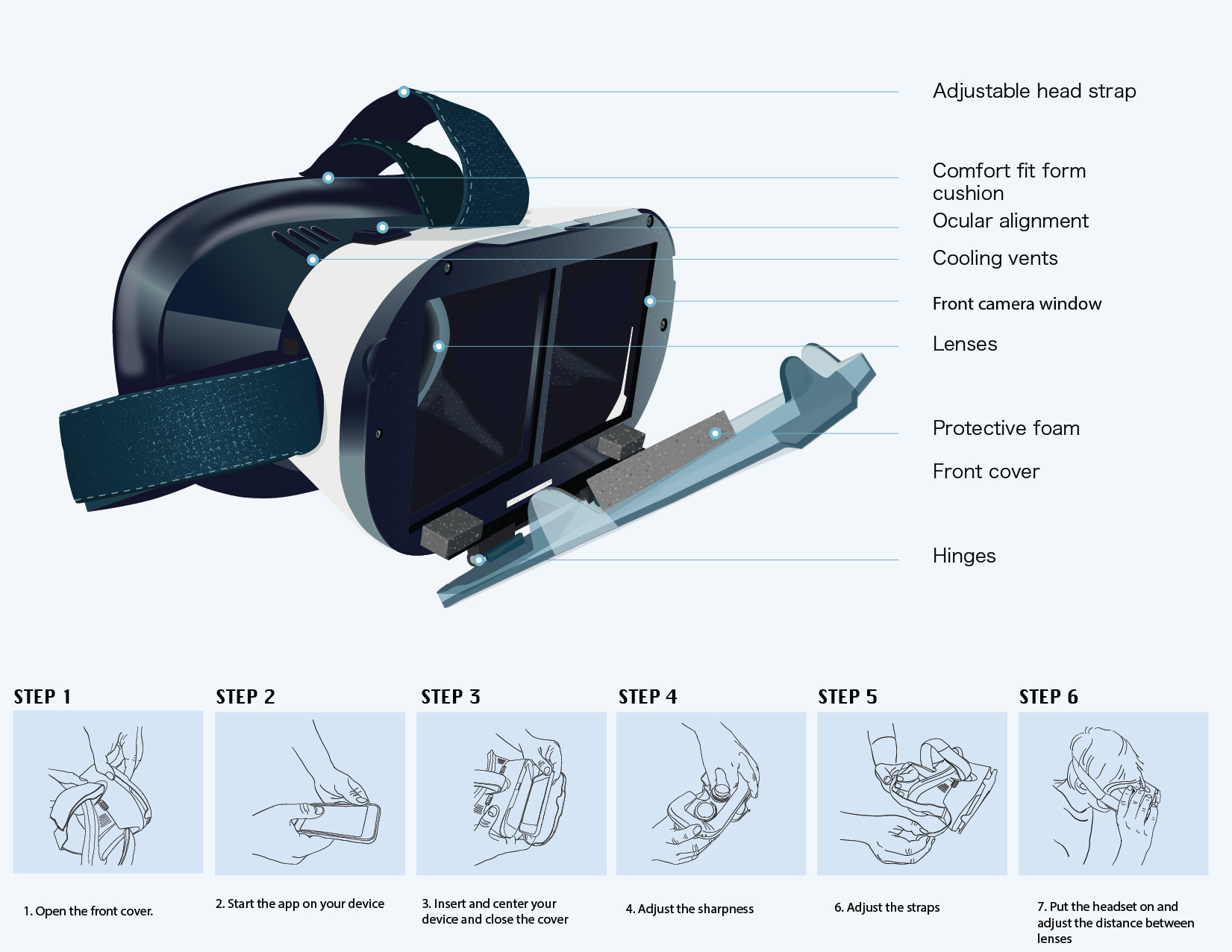
A finished final vector drawing of the product. It took me many hours to complete. I tried to make it as real as possible.
LAYOUT AND COLOR EXPLORATION
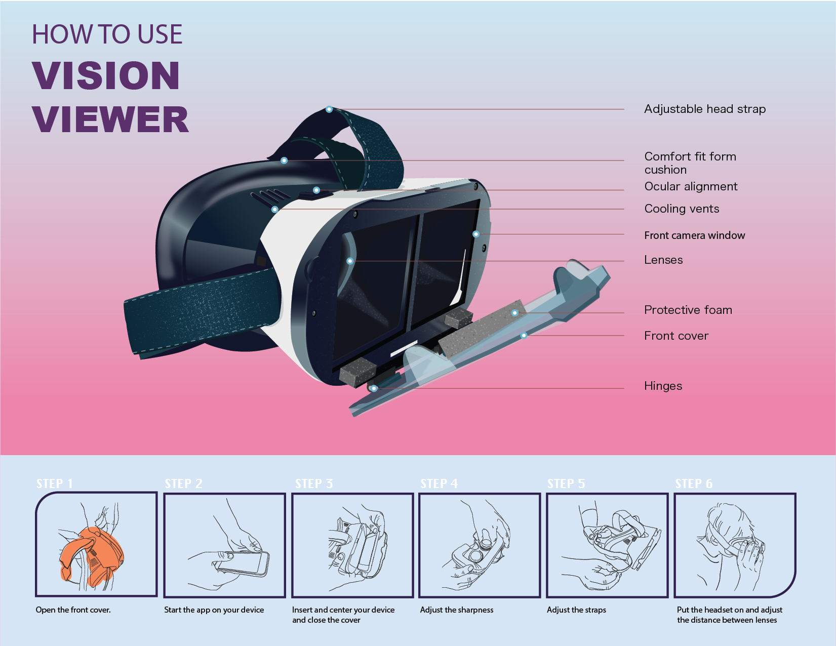
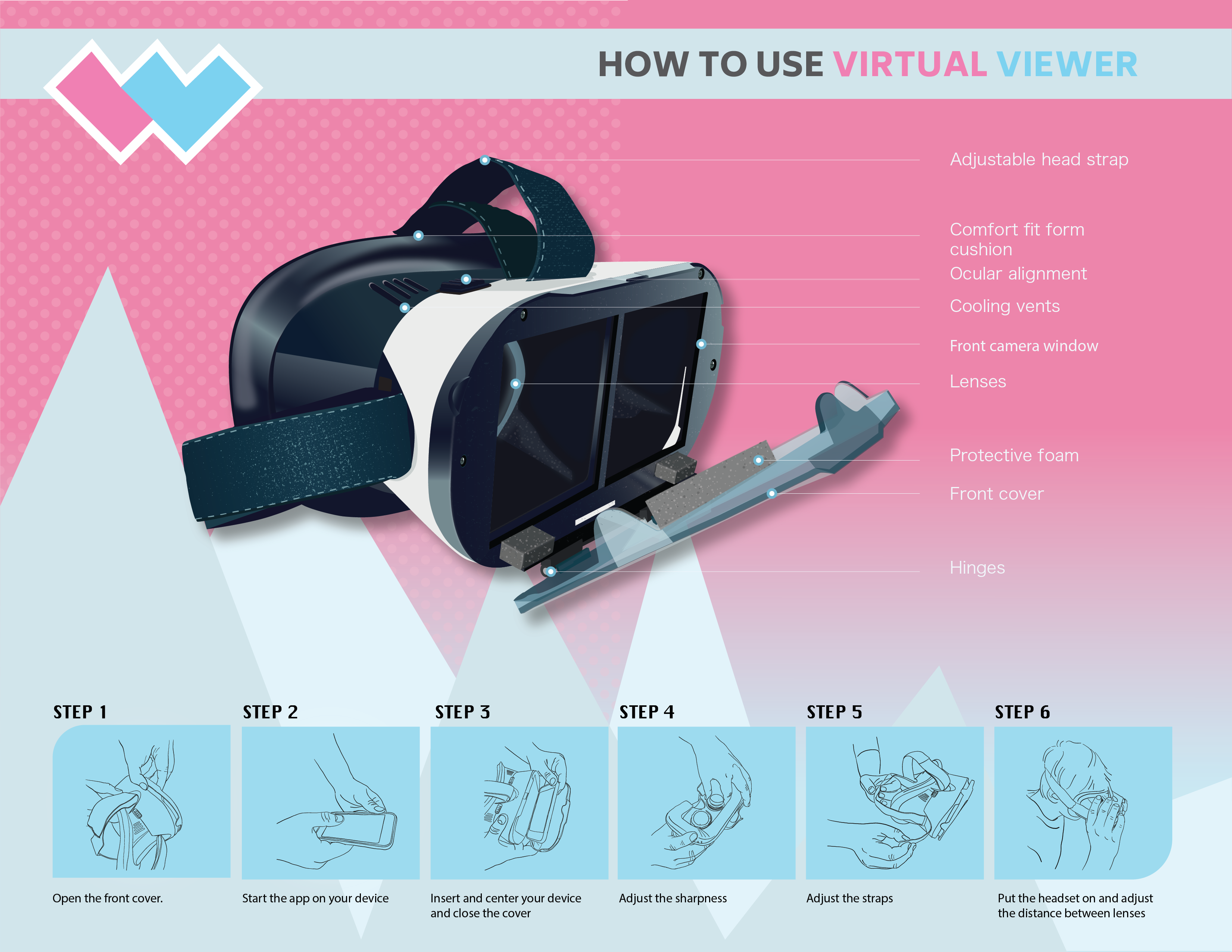
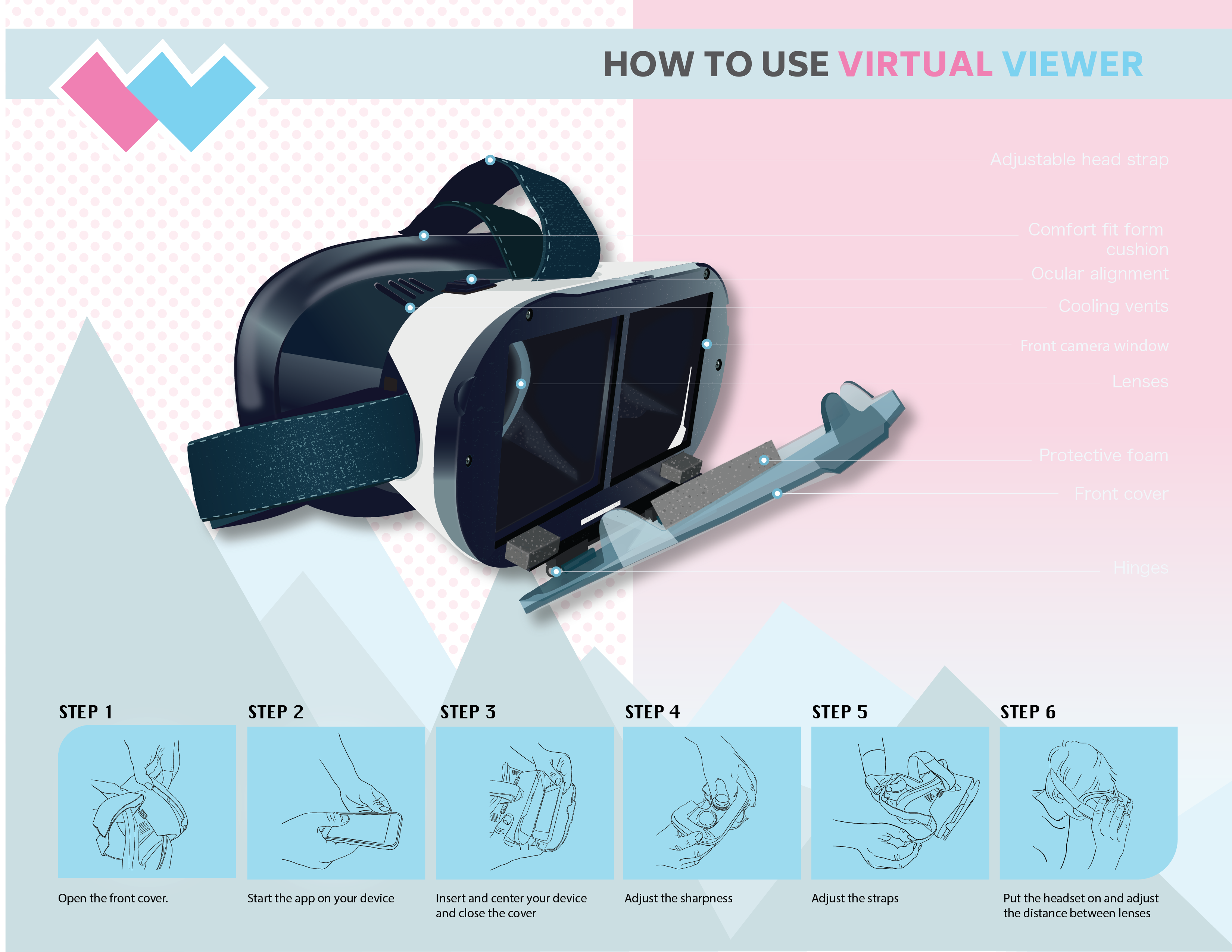
Below there are many different layouts and color explorations. At the beginning, following the feedback I got in the classroom, I tried to make the design gender specific. The final result though looks very outdated. I think that desing has to be unixes, because doing the design for girls, I really would have to follow stereotypes, which are no longer true. My final design resulted in a unisex color and layout that could by enjoyed by anybody.

LINE AND FONT EXPLORATION
