My last project for Typography class this semester
was to build a website about Marian Bantjes.
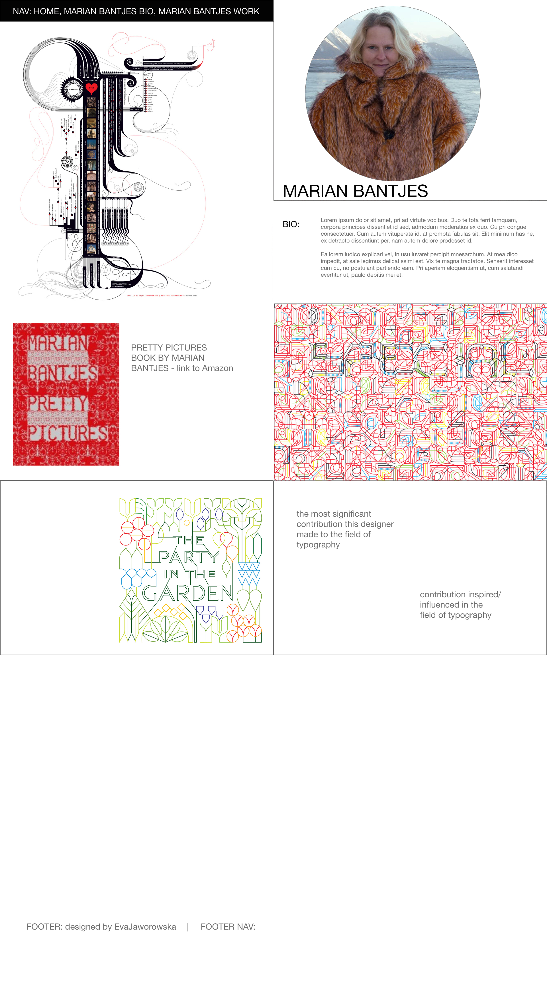
Marian Bantjes is a Canadian typographer who creates beautiful and yet sometimes very strange designs. I guess she’s that kind of designer who can create a piece of art out of a bowl of soggy cereal because an inspiration struck her while she was eating it, and it’s up to you if you like it or not, or your misfortune (if you don’t like it) that it happened during her eating cereal. 😉 She notices beauty in the most tacky things and then she separates them and and creates something new out of it, something that complements that little detail. Maybe it would be light reflected in a wet cereal, that looks beautiful? Or the texture of falling apart piece of food? I believe it could be anything. There’s no formula for that.
I finally understood that after I’ve created her website. She is like nobody else, really. She has so much courage to explore ideas.
Creating a website about her was a big challenge for me because I just couldn’t understand her artwork. It is very busy, colorful, with lot of overwhelming details and colors. Then I just thought: what I wouldn’t do and I did exactly that, like putting macaroni around the borders.

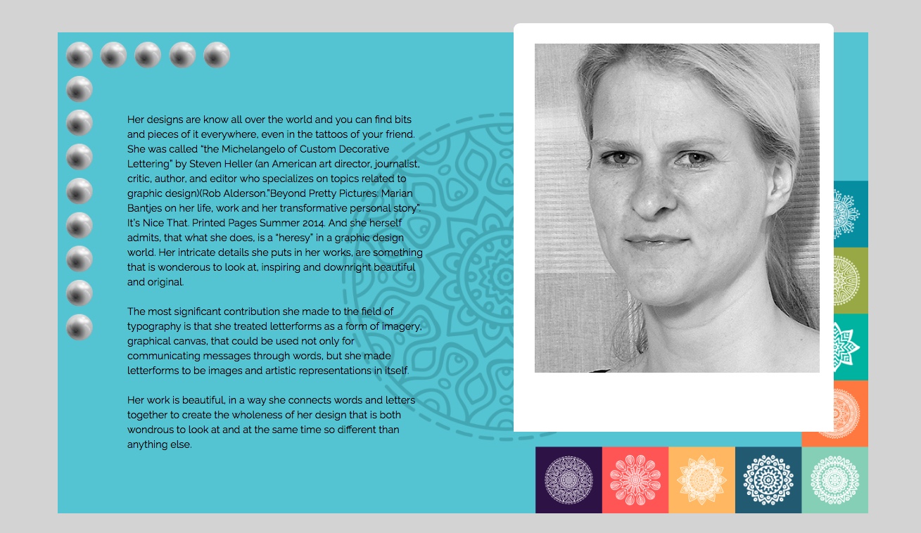
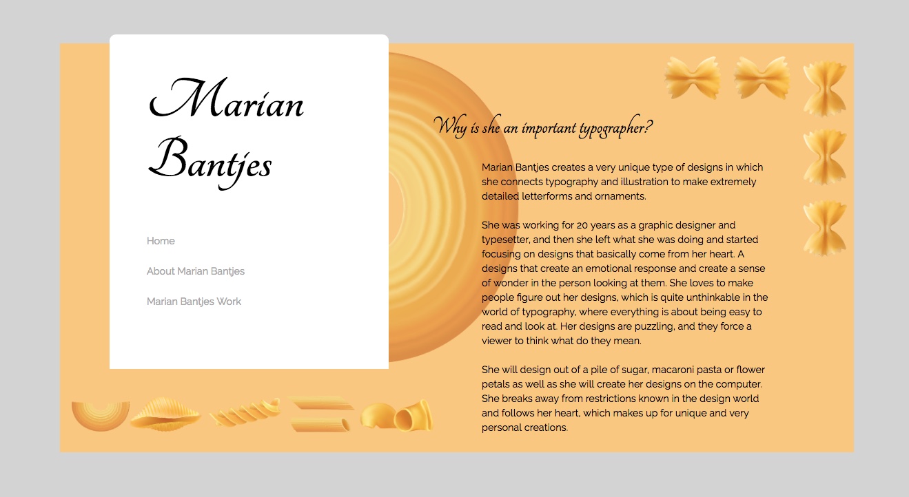
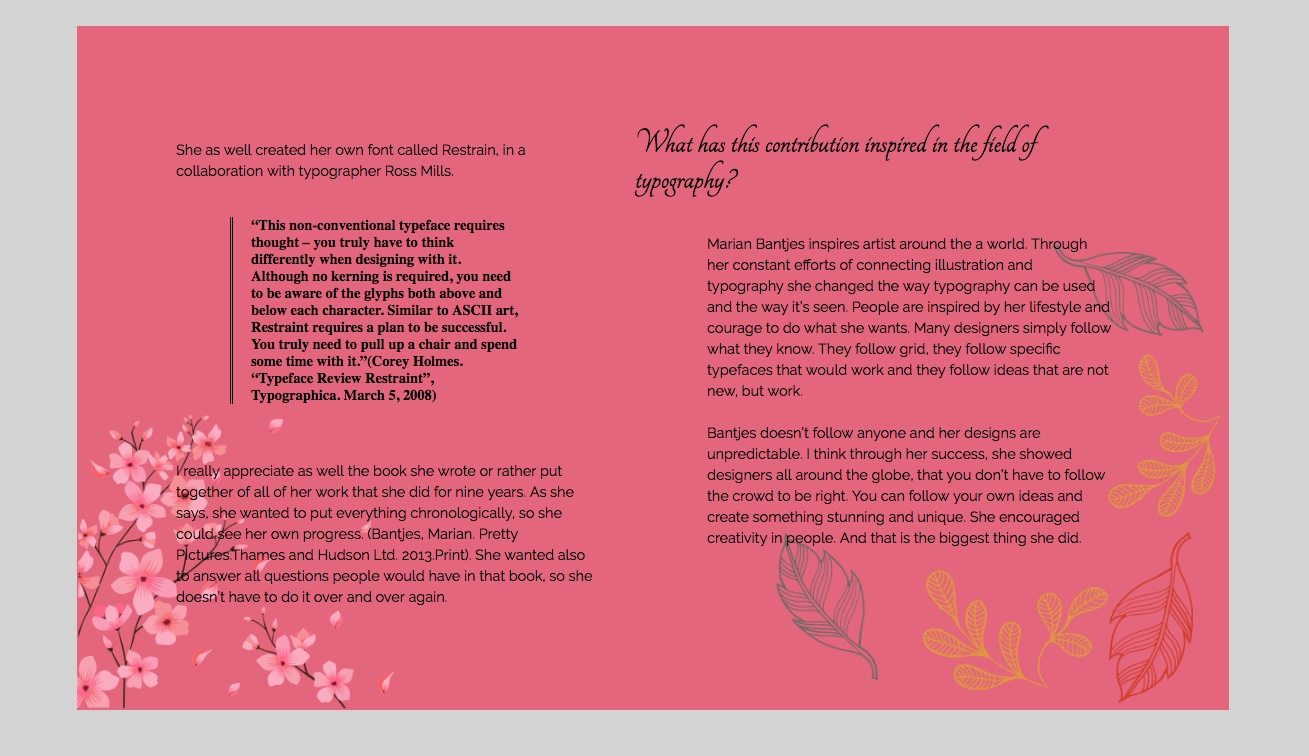
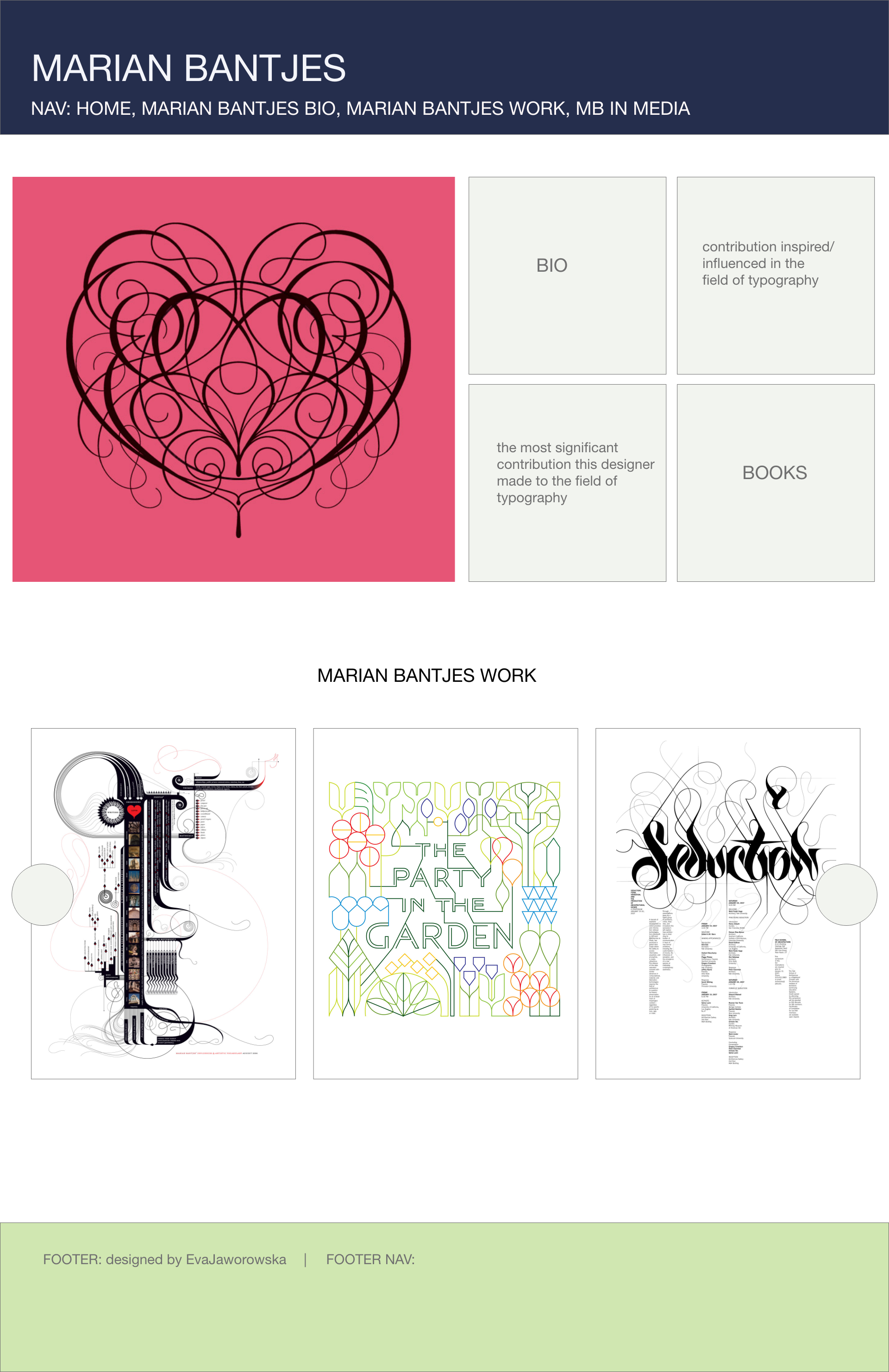
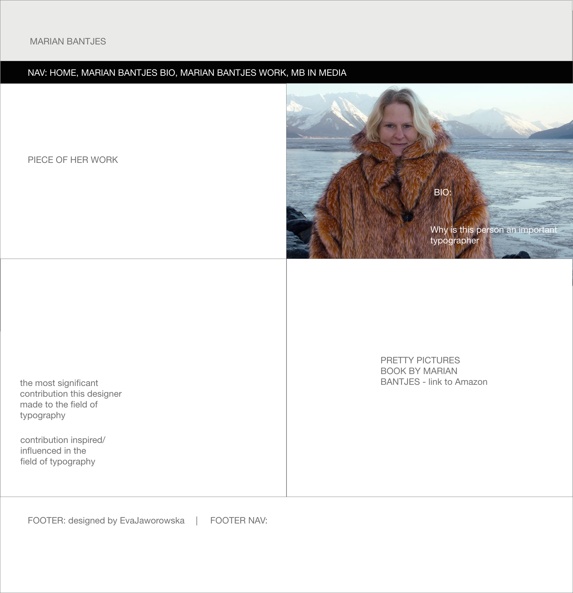
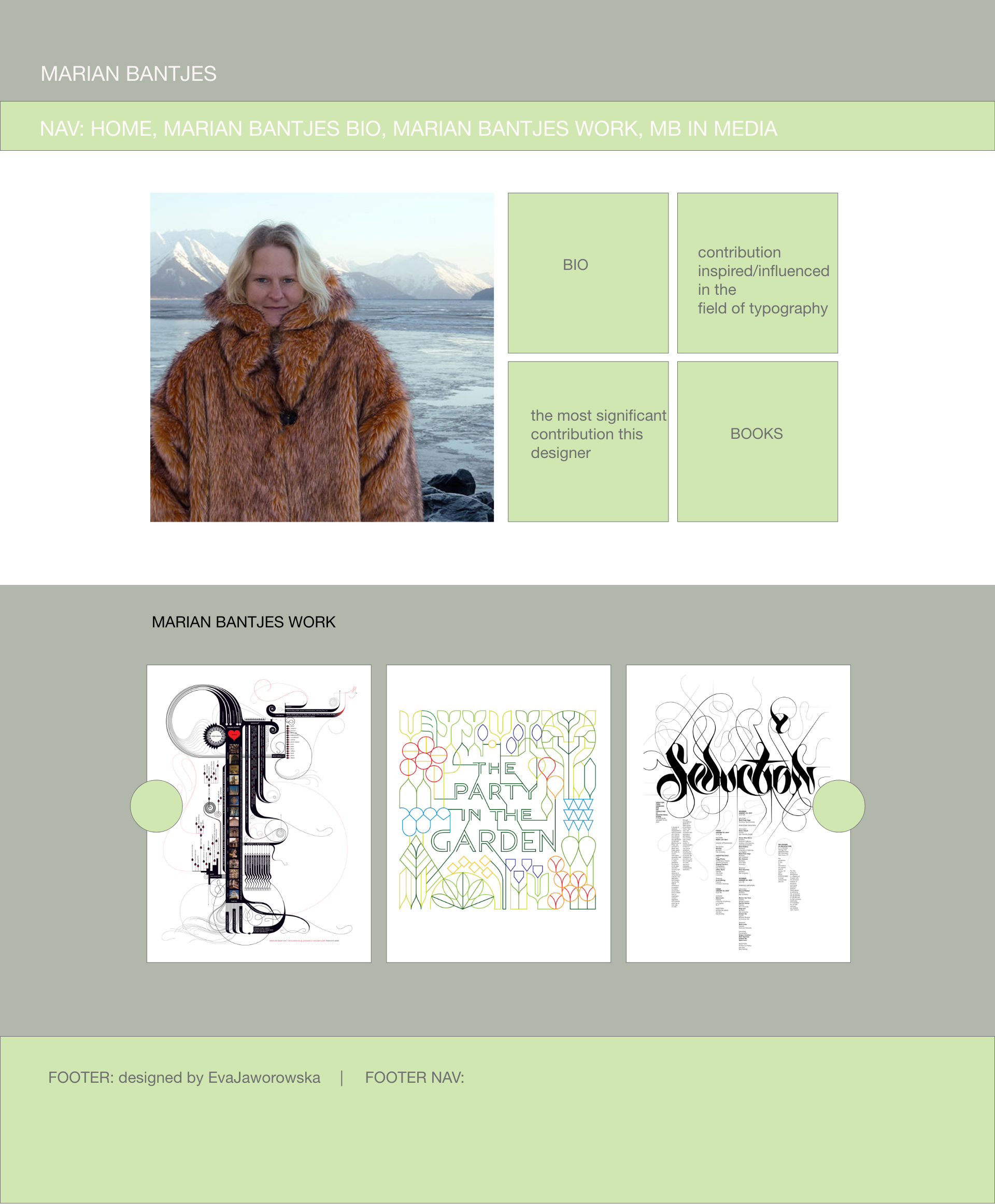
PROCESS WORK