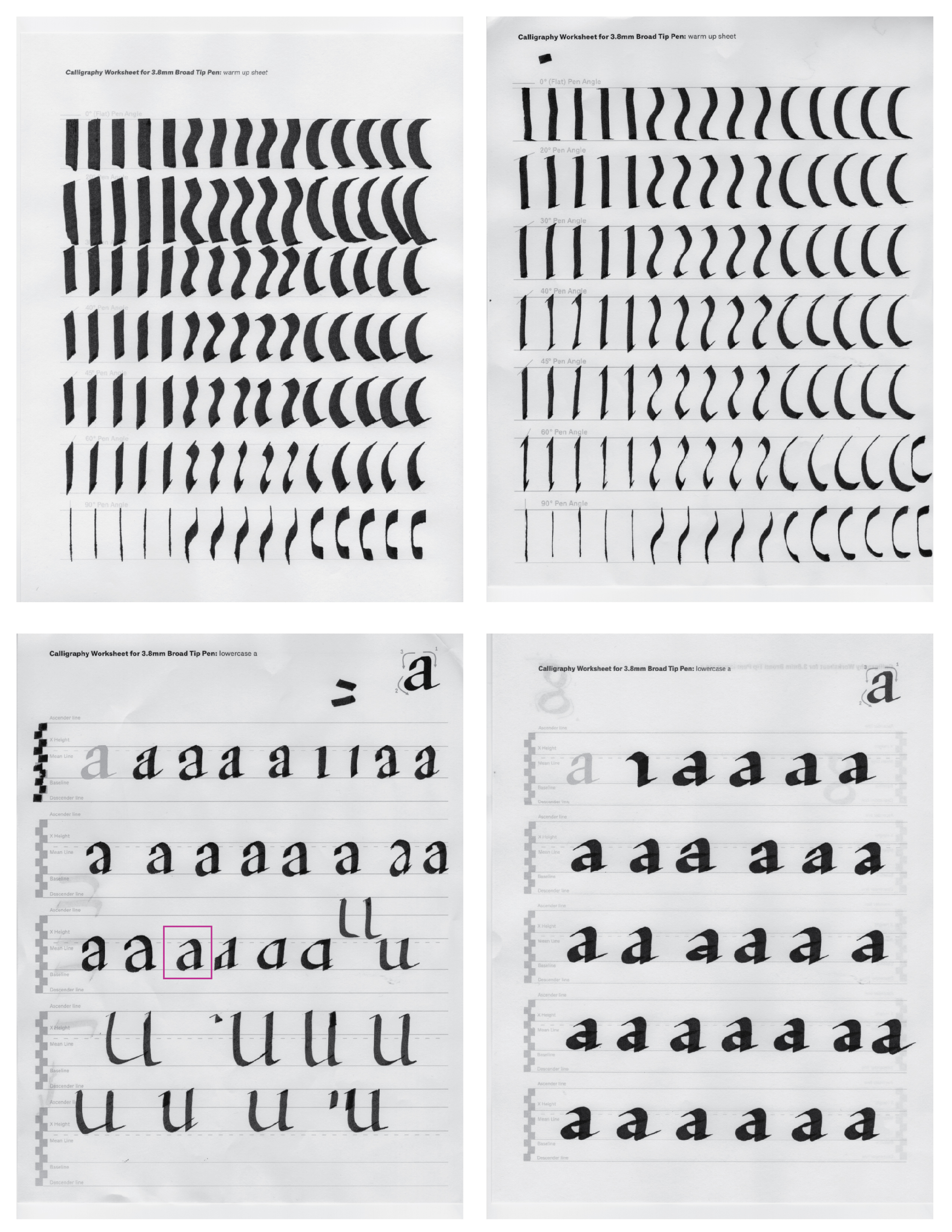
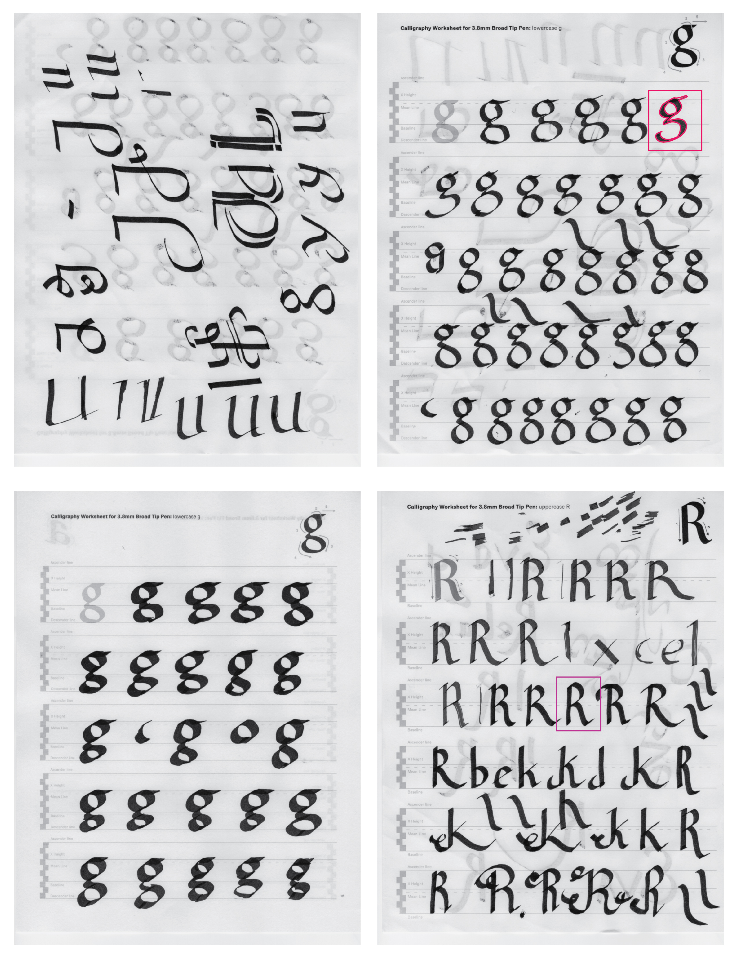
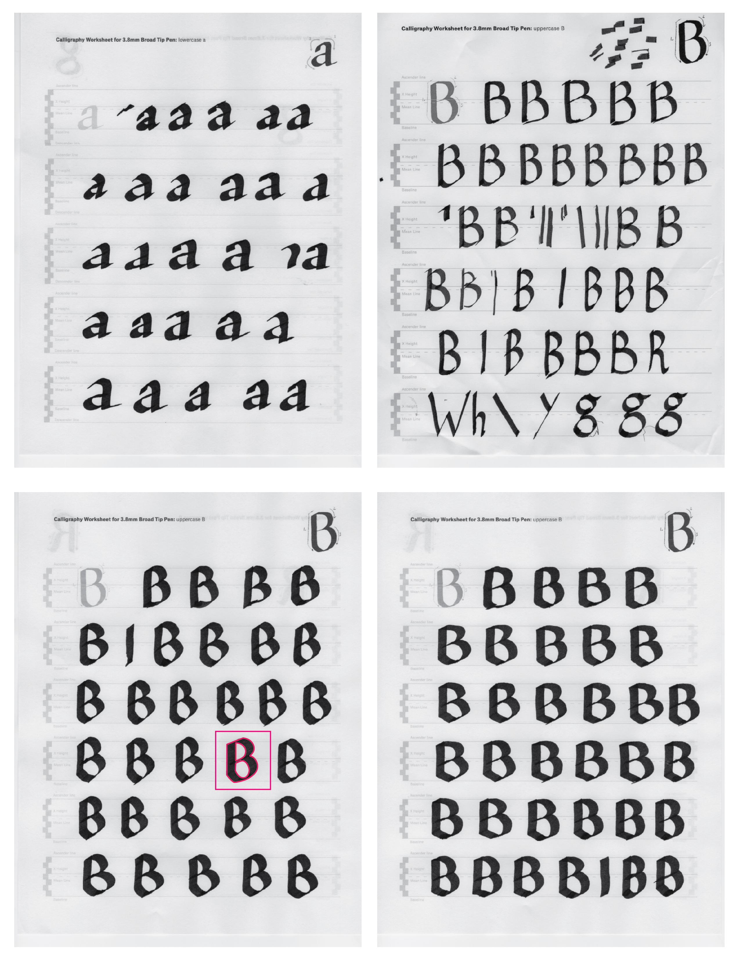
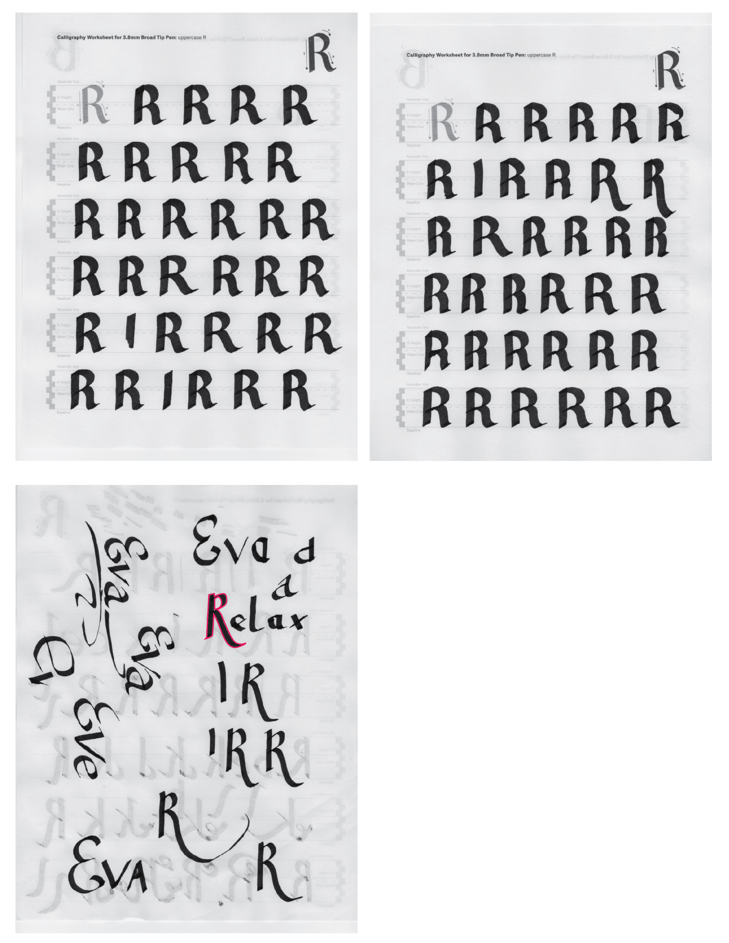
To construct these letter forms I used Pilot Parallel Pen I got at the art store. It was one required in the classroom. The one we had in the classroom must have been a bit smaller, because the one I bought creates much thicker lines. I wish I knew! I would bought the smaller one.
The biggest challenge I find when trying to do calligraphy, is to keep the pen at the same angle. It just feels weird not being able to turn it at least a bit! No matter how many pages I filled up with lines and strokes, it still feels unnatural.
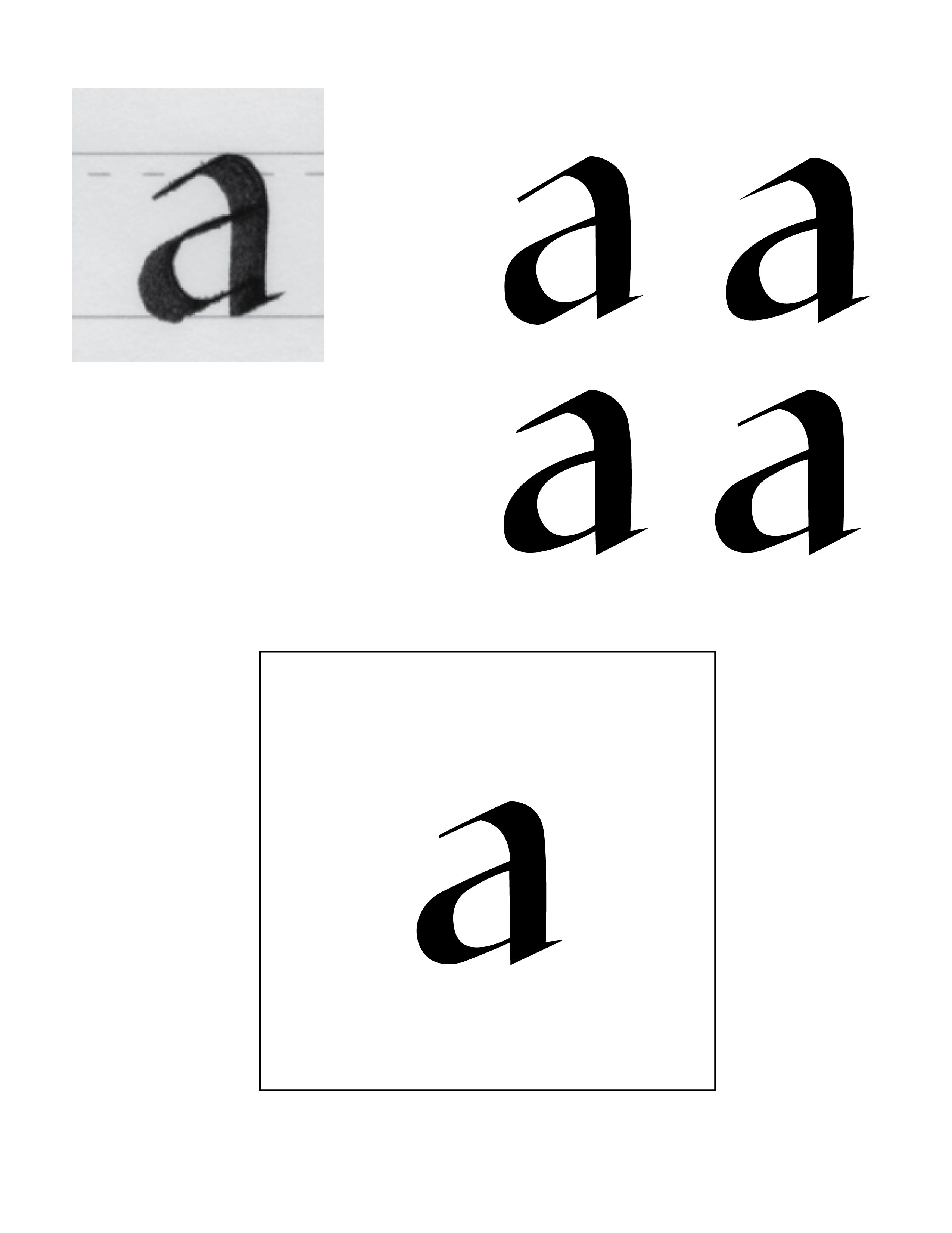
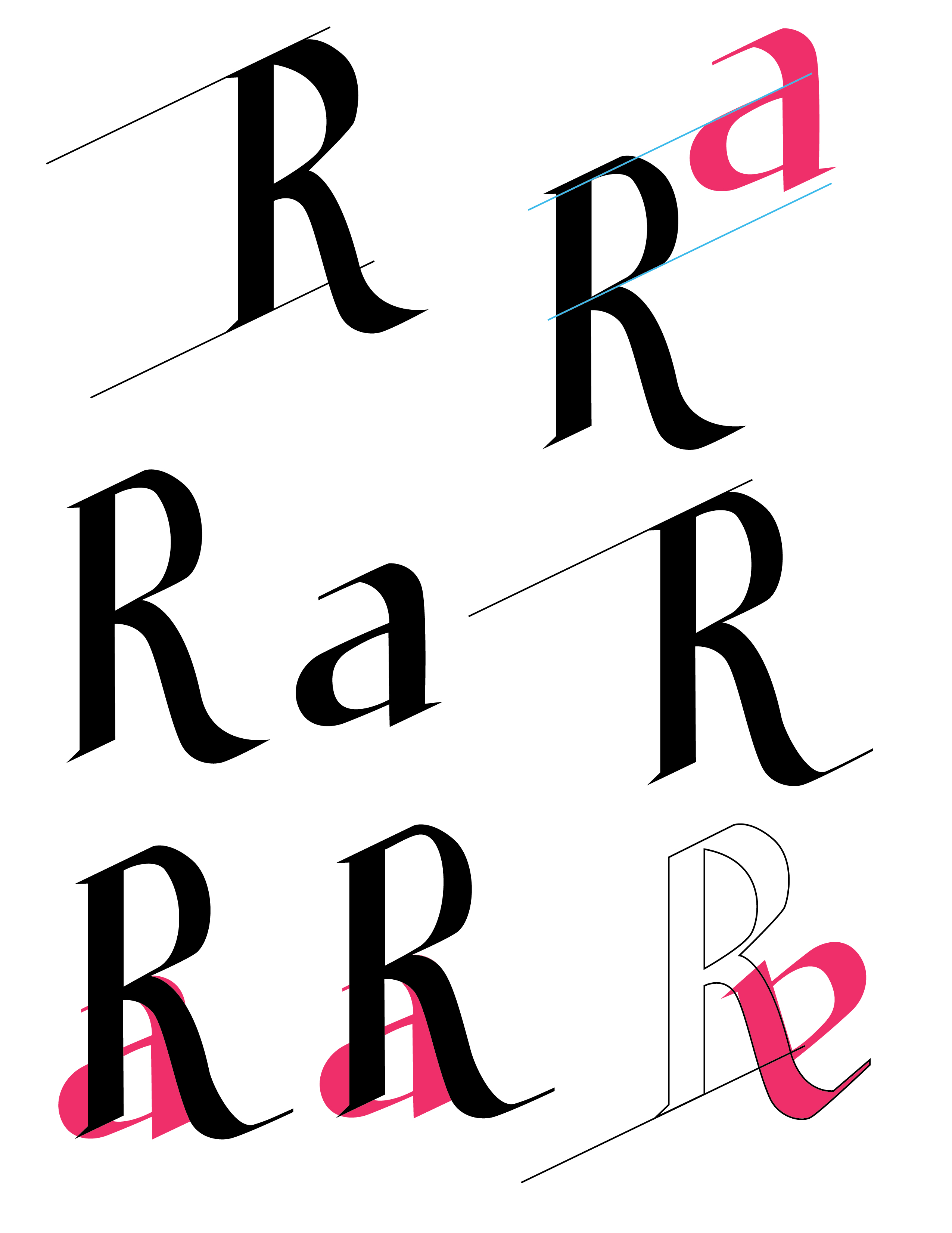
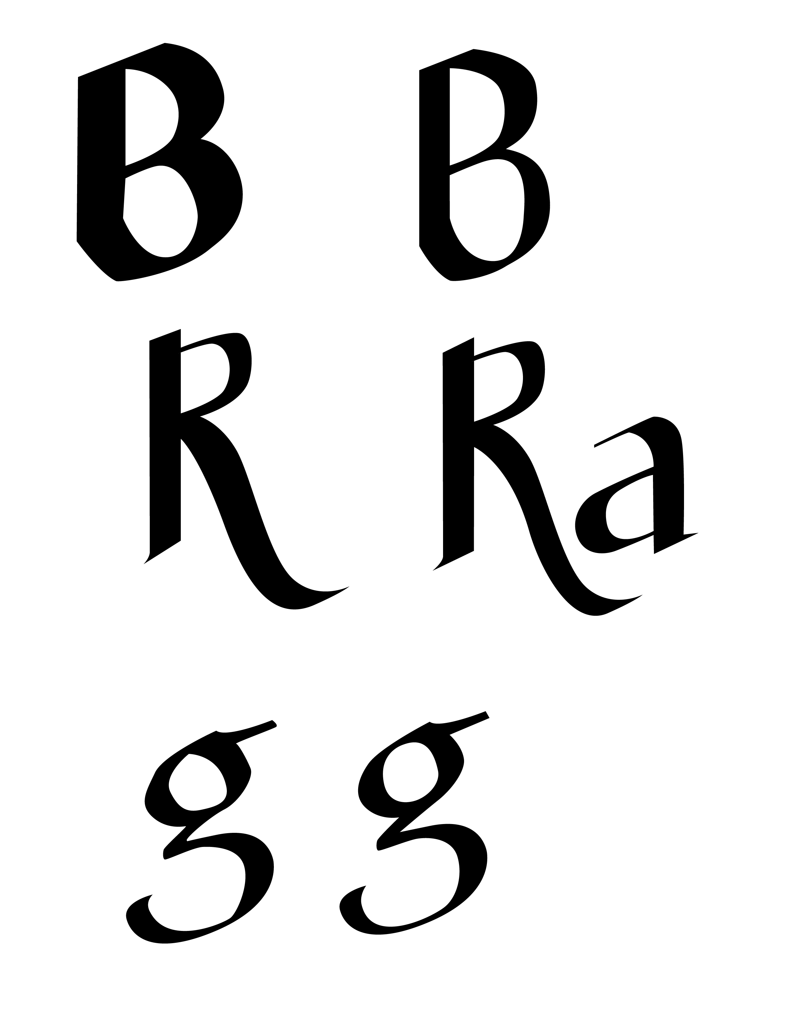
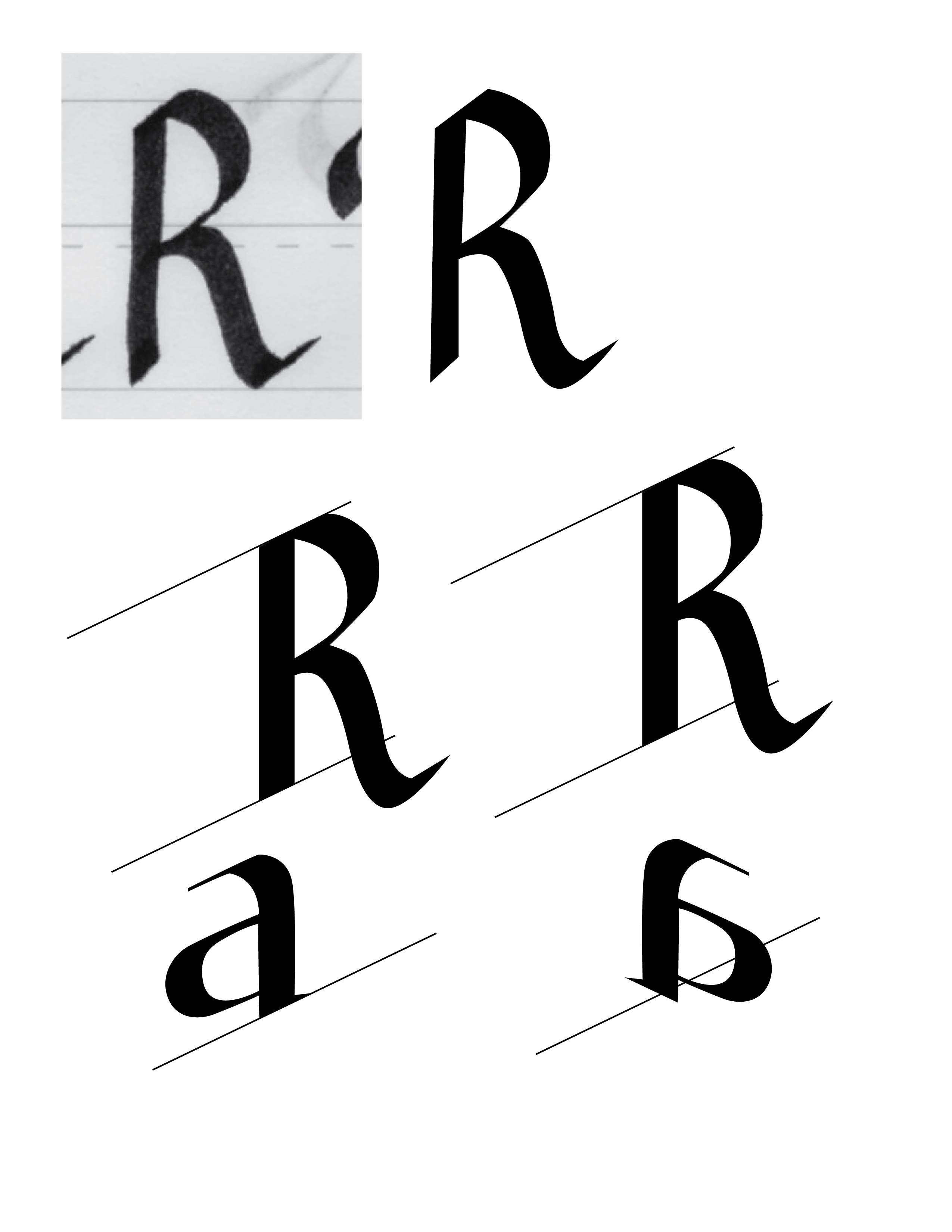
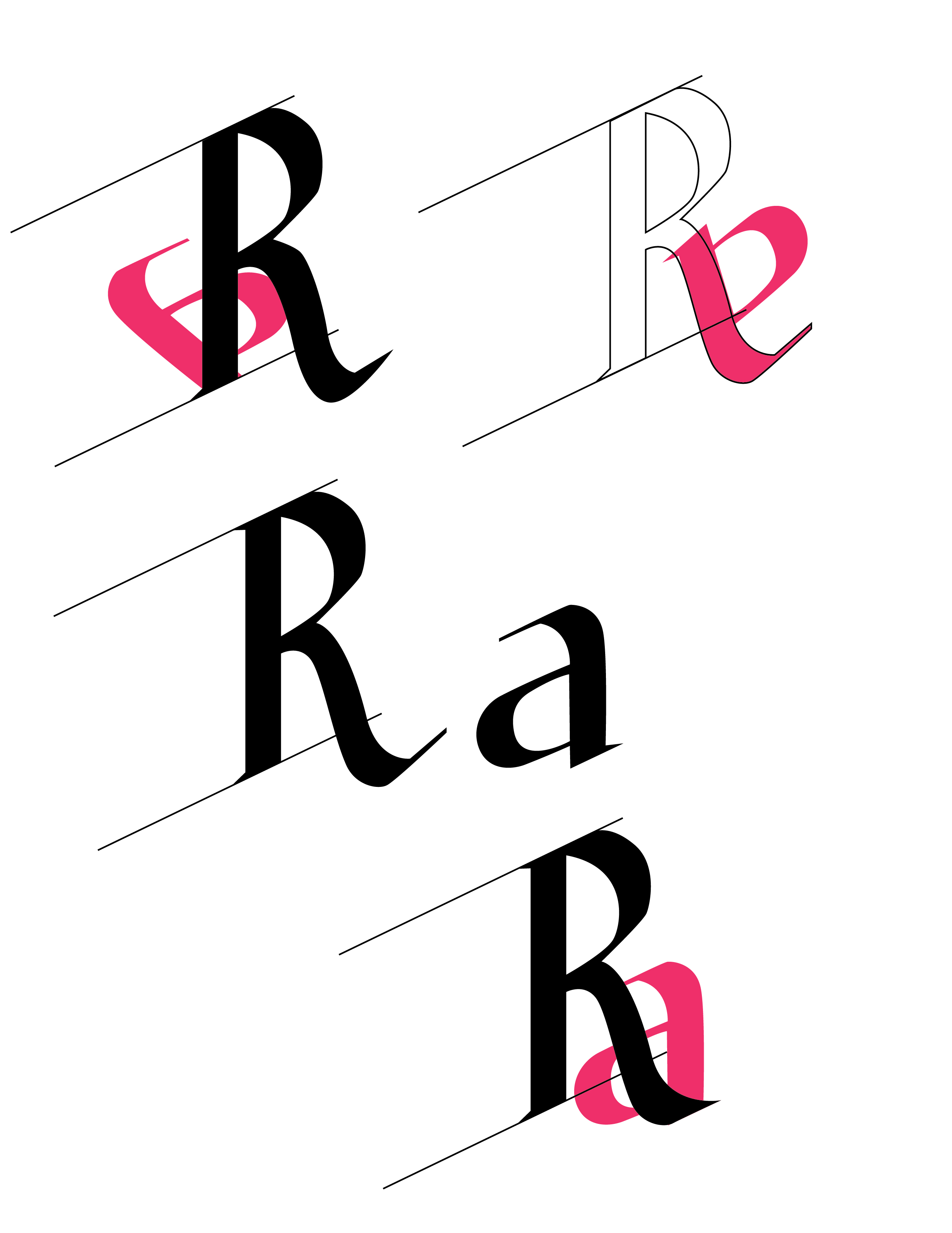
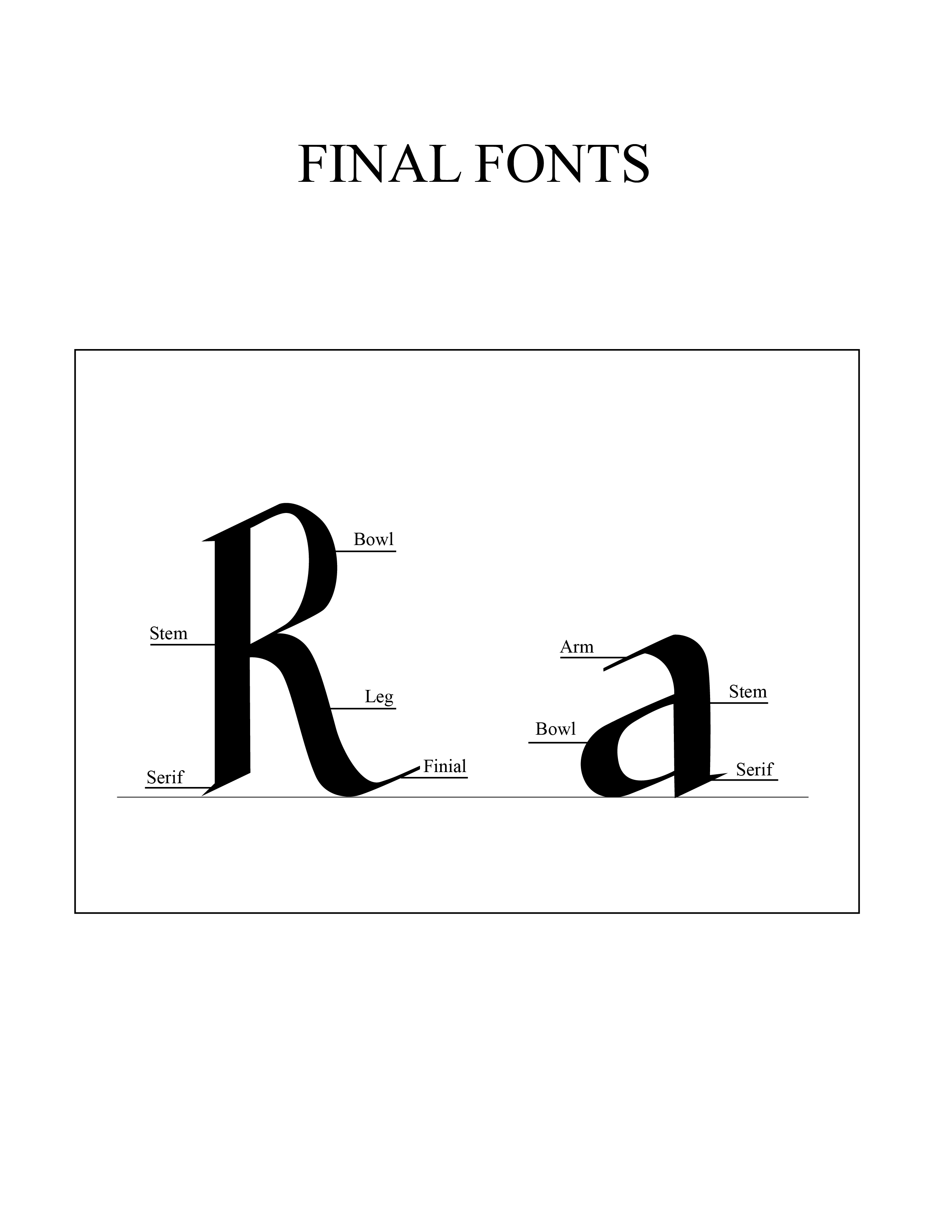
For this project I had to choose one uppercase and one lowercase letter and then trace them with a pen tool in illustrator. I tried tracing b and g, but decided that R and a look the best. It was challenging to make them look like from the same font family. I compared the stems, the bellies… and did as best as I could.
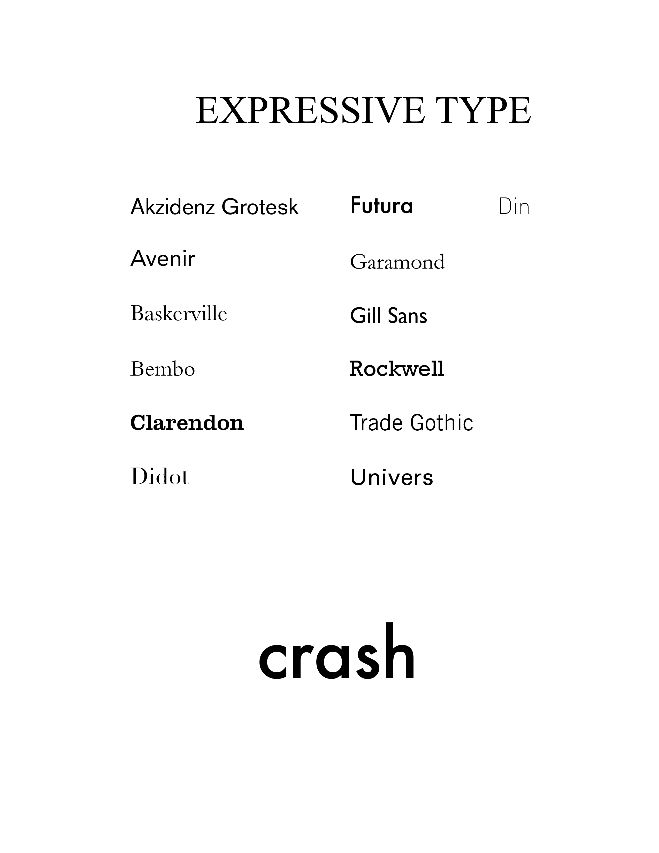
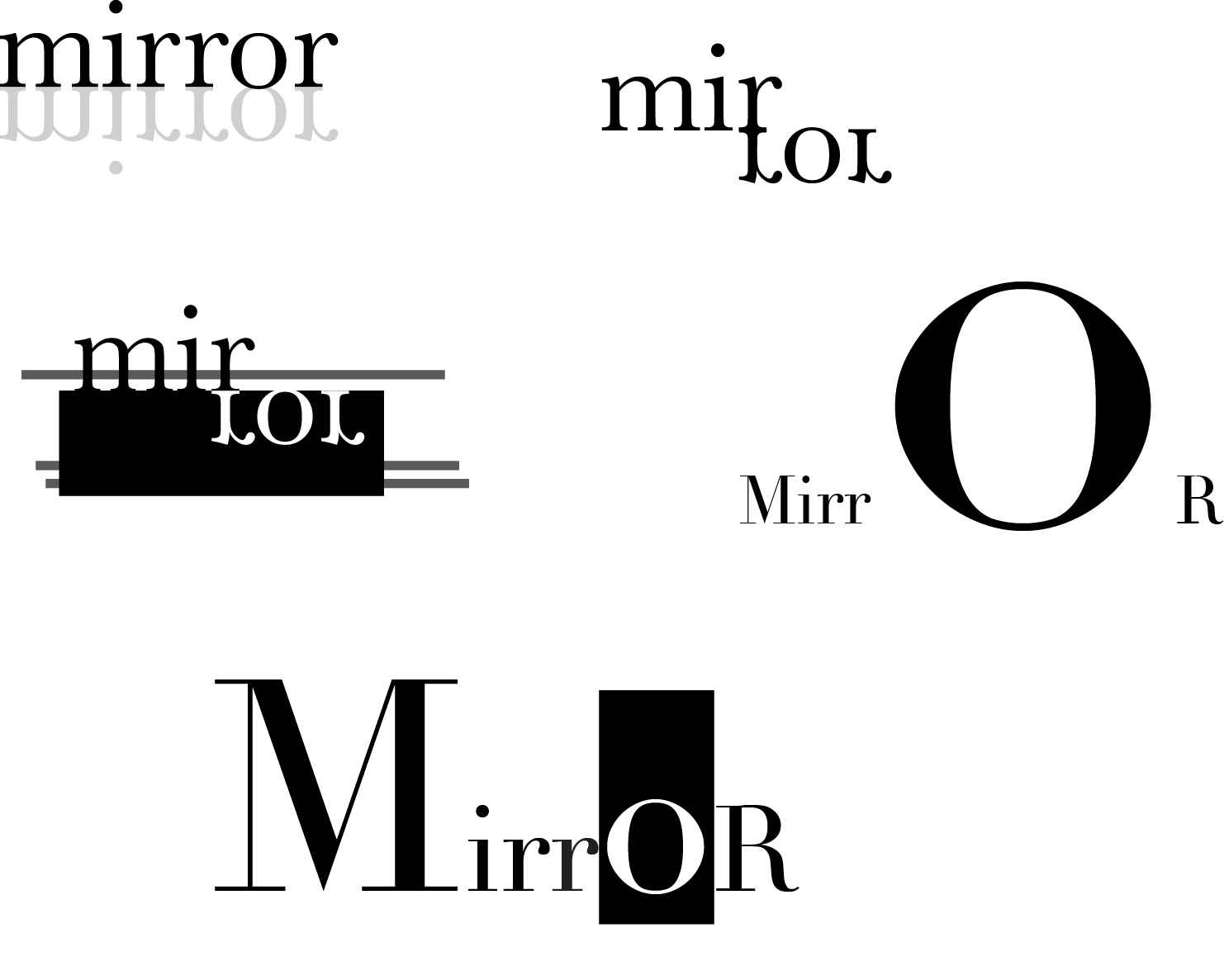
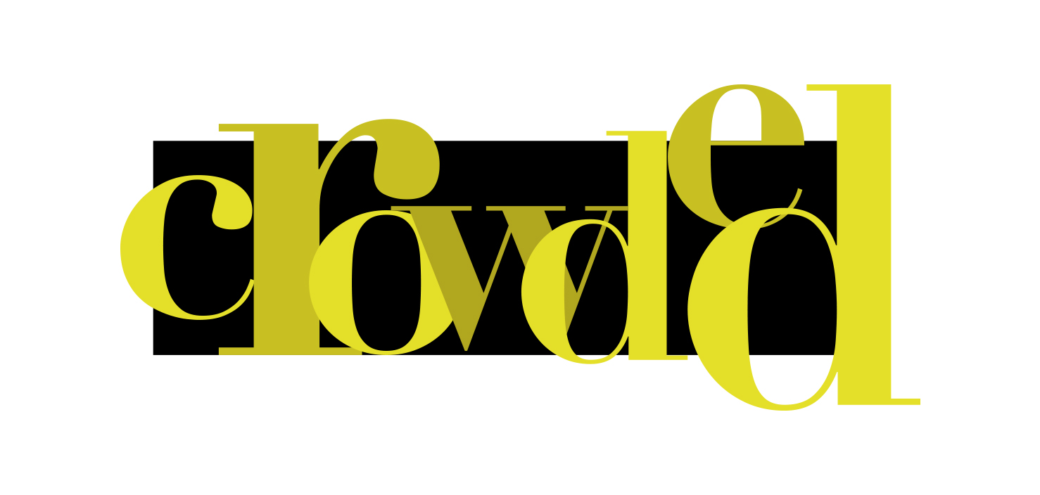
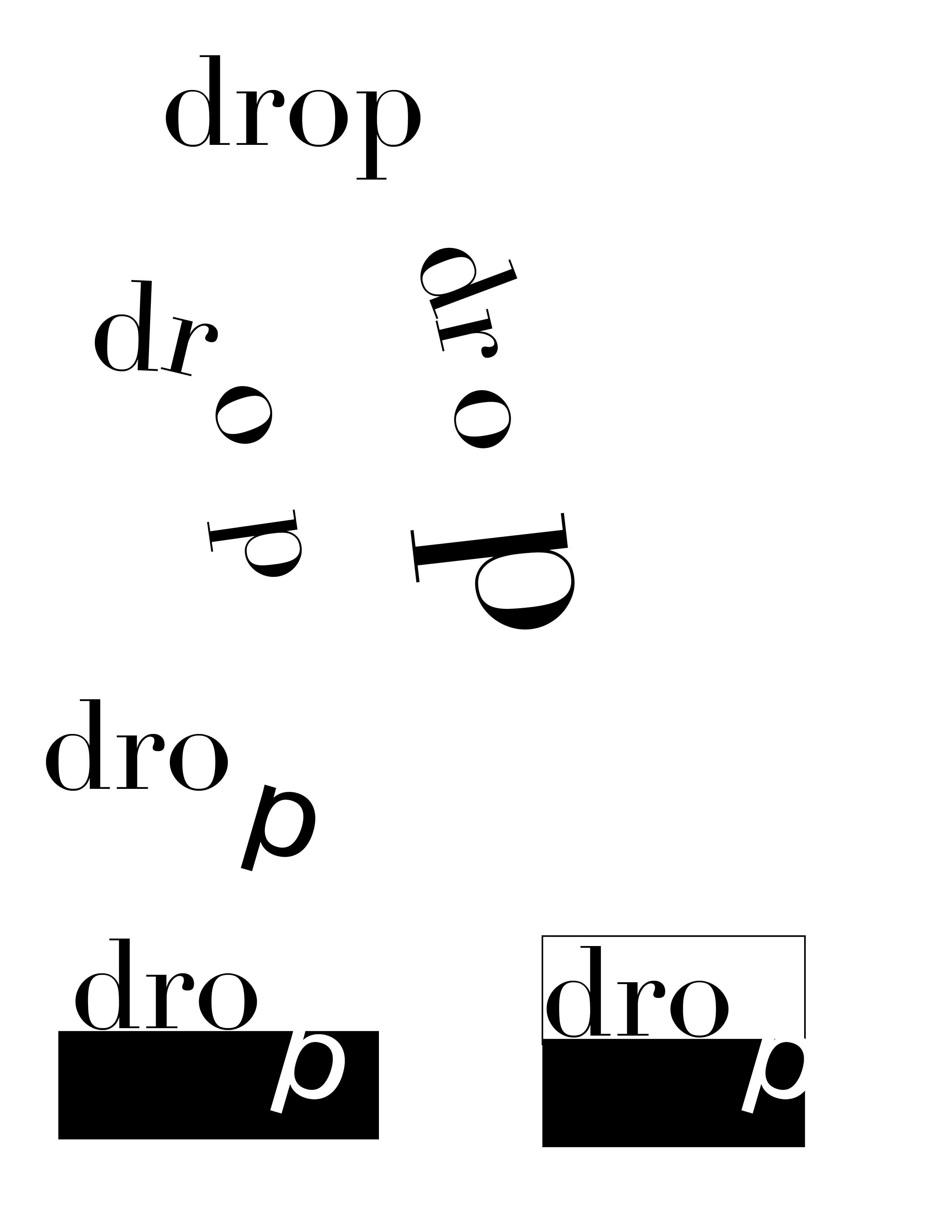
Expressive Type