DESIGN STATEMENT
For this project, I wanted to create a video with a font that would be easy to look at and easy to read. I chose colors based on what we’ve learned about color psychology in the first year of Interaction Design and the font based on the message and voice of the speaker.
Overall I’m very happy with the end result.
The animation and the font choice works really well with the message and looks interesting enough, to grab the attention of the viewer.
AUDIO CLIP TRANSCRIPT
“You see what stands between us and achieving even our the most ambitious dreams has far less to do with possessing some magical skill or talent, but far more to do how you approach problems and make decisions to solve them.”
Some people might be tempted to think that to achieve the success you need some special skills or talent. In his speech, Duneier, who is a Guinness World Record holder, argues, that the key to success is in the way we approach problems.
Decisions we take to solve the problems will decide on the outcome.
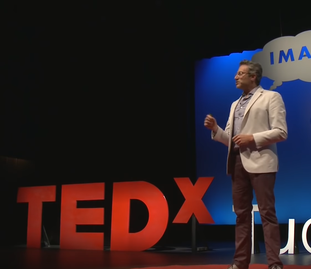
Stephen Duneier is a professional investment manager, strategy consultant, speaker, lecturer, author, artist and Guinness World Record holder.
OSWALD as typeface of my choice for the project
Oswald was created by Vernon Adams who was prolific typographer designing fonts for the cloud-based era. Some of the fonts he designed are Monoton, Bangers, Holtwood, Stardos, Mako, Francois, Nobile, Norican, Amatic, Damion, Michroma, Bowlby, Pacifico and more.
His fonts comprise of 50% of all Google fonts catalog.
Oswald is a redesign of the classic style represented by the ‘Alternate Gothic’ sans serif typefaces. The letters were redrawn to fit the digital screens better and are freely used across all desktop computers and mobile devices.
Vernon passed away in 2016, not finishing his work on Oswald font.
I chose this font because it’s a universal font. It is elegant, and yet it is not unique
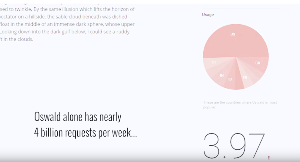 in any way. I feel it fits the message entirely because the solution to success that audio clip is trying to convey is nothing new or neither it is unique. The subject of success is widespread, and a lot of people is interested in how to achieve success. According to Vernon’s family, the font has almost four billion requests per week – it gained global interest, similarly like the subject of success. Although this font doesn’t have any distinctive look, it has been quite successful.
Visually Oswald font seems a bit tighter than other fonts and a little bit taller, with a certain look and shape. It looks clean and elegant and yet robust. There are no thin and bold lines, but rather all of the lines are of the same thickness. Because of that, the font seems very logical and fact-oriented. There’s no magic to it. It is straightforward.
It not only fits the message in the audio clip but it fits the voice of Stephen Duneier, who is a businessman and speaker, but as well as Guinness Record Holder.
Both font and Duneier have something global to them. Both achieved certain success globally, and yet Duneier is the same simple, not sticking out of the crowd kind of person. There’s nothing unusual about him. And his solution is the same: straightforward, no magic, no special talent oriented approach.
Even physical characteristics of Duneier fit the attributes of Oswald font. Put next to each other, and they create a certain wholeness.

Mood Board
I decided on using a dark navy blue color for the background and white font color for the project.
I chose the navy blue color because color blue is considered very calm and logical. It’s been linked to intelligence, and it is proven that blue color improves focus, concentration, and mental clarity. And that’s exactly what you need to solve problems and achieve success: thinking and mental clarity to approach them. Because of that, I think the color blue will improve the concentration of the viewer, and at the same time, it will help to get the message across.
White color for the font represents perfection. White is impartial, brings calmness and is neutral towards anything – similarly, the audio clip advice will work for anyone.
Because of that, I believe blue and white were the best choices for the color making decision for this project.
FINAL VIDEO
WHAT WOULD I DO DIFFERENTLY NOW
First of all, I would pick a different audio clip! The clip I chose is from TedTalks, and though it has a great message in itself, it doesn’t leave much room for creative design! I wish I had picked something sarcastic or funny!
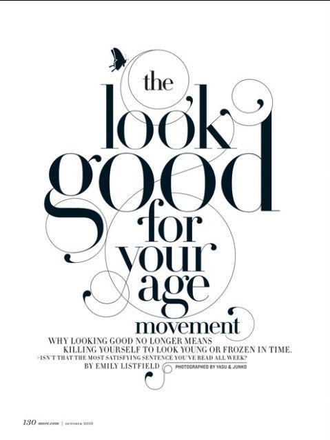
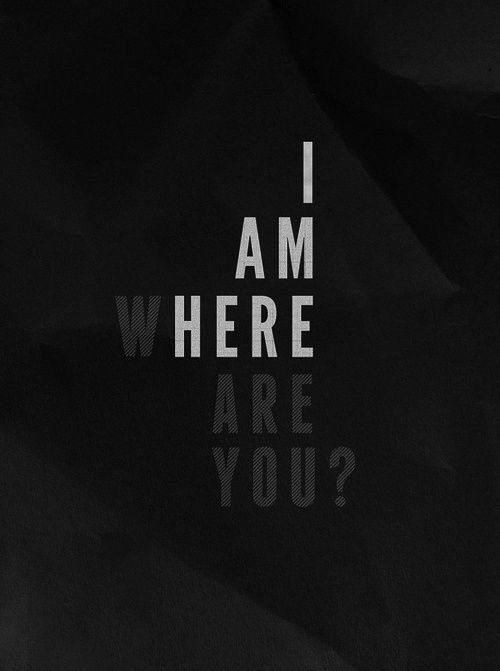
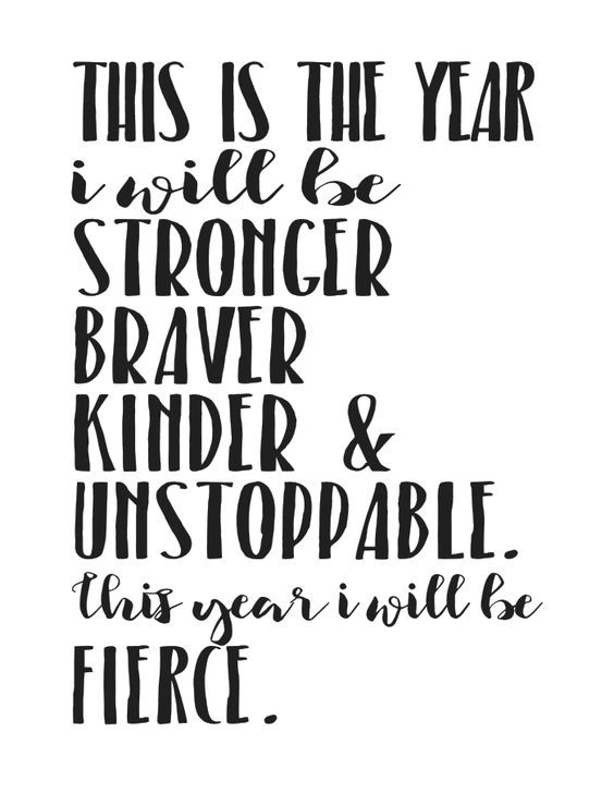
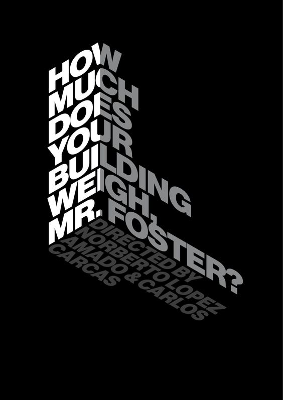
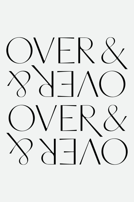
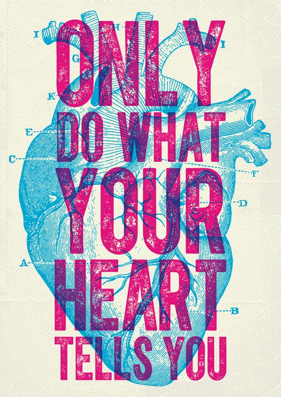
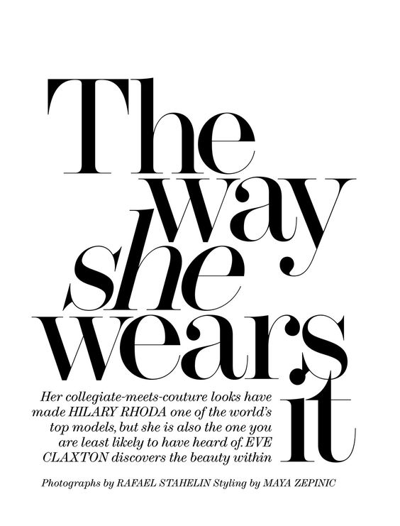
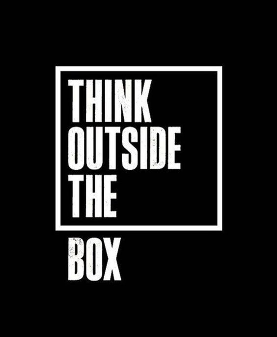
INSPIRATIONS
These were some awesome suggestions sent to me by my prof to start the project: