BOOK SYNOPSIS: HORIZON SHADOW
Doug is a funky alien who lives on a planet in the far reaches of space. He is a part of an alien civilization that has always lived in peace. However, when an armada of evil robots threaten to enslave their people, it’s up to Doug and his friends to find out a method of defeating the incoming menace. They will travel to the corners of the universe in search of fragments of a LEGENDARY artifact called “the Horizon Shadow” in order to inspire hope within the hearts of their people and protect their planet.
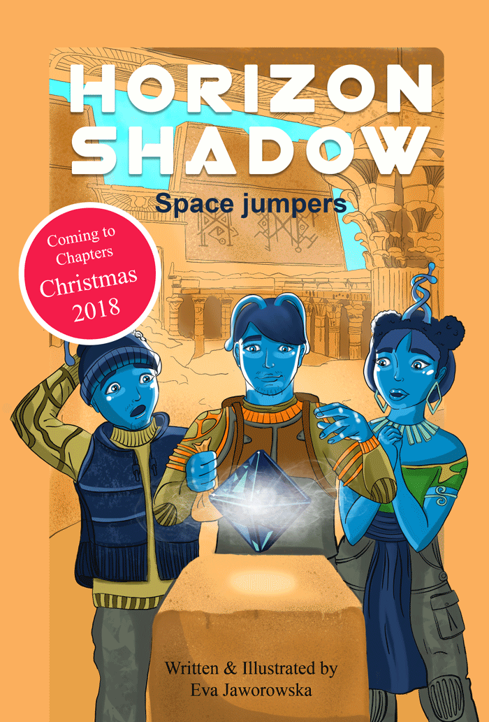
DESIGN STATEMENT
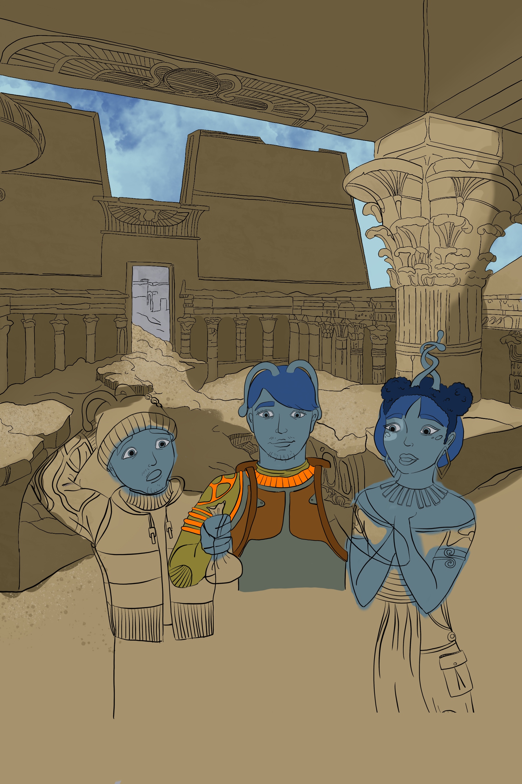
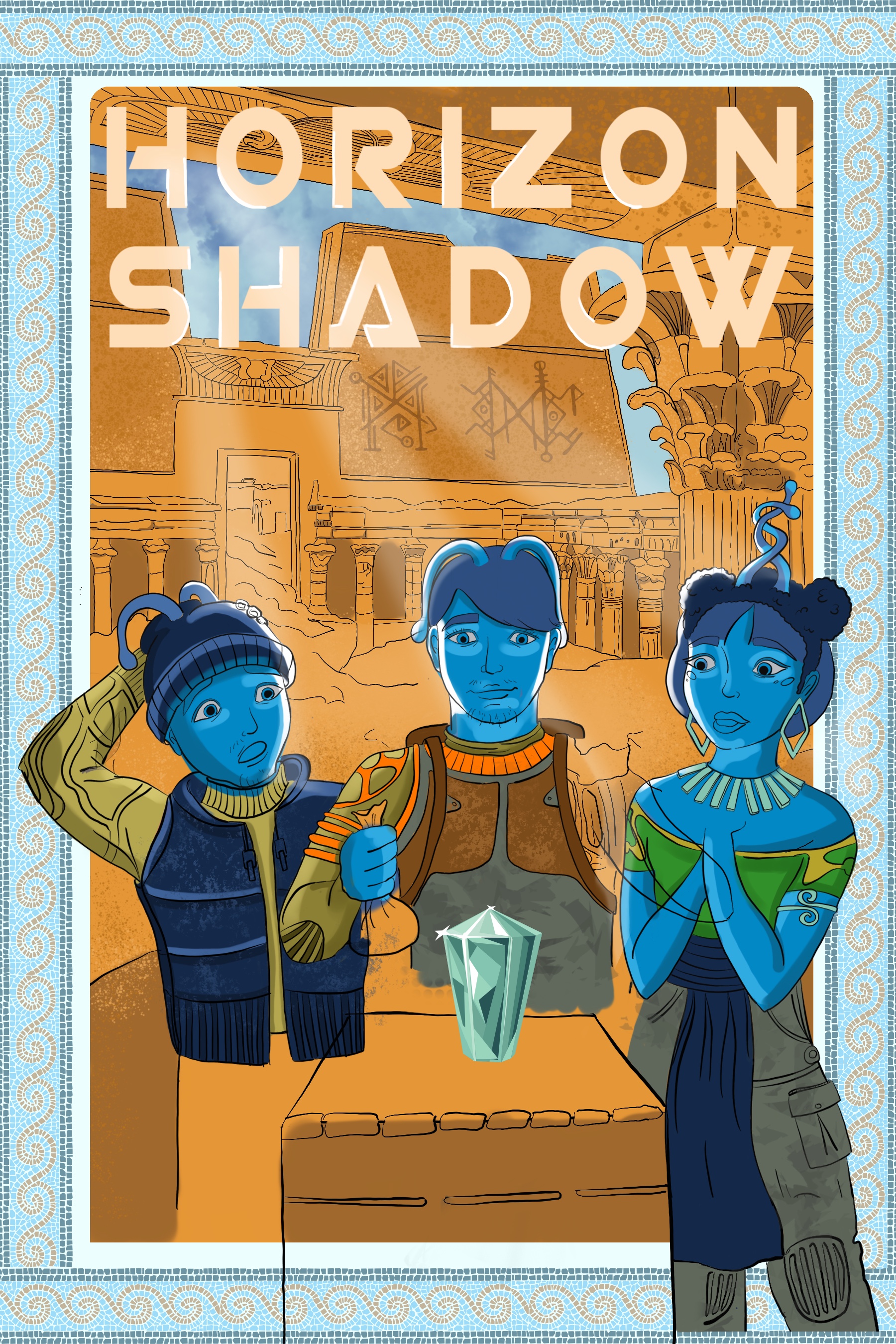
The biggest challenge when creating a cover for the Horizon Shadow book was the illustration. I knew from the beginning that creating an enticing digital painting will be considerable difficulty. Out of the many ideas I wanted to pick one that will stir the imagination of the viewer to the point one will wonder what exciting things could happen if you had that mysterious artifact in your hands. Right before reading the book, even before opening it, I wanted to create in a reader an illusion of the fantastic adventures he is about to embark on. The moment in which three alien teenagers surround the artifact is a pause in time. One can only see the object floating above the ancient stone, and kids’ faces light up by a magic glow. They are about to take the cube into their possession. The viewer should be able to see the excitement, wonder and focus on kids faces and that alone should make him wonder too. I believe this design fulfills its mission and creates a sense of wonder in the viewer. The animation adds to the suspense and furthermore builds the illusion of the fantastic adventures readers
will begin once they start reading the book.
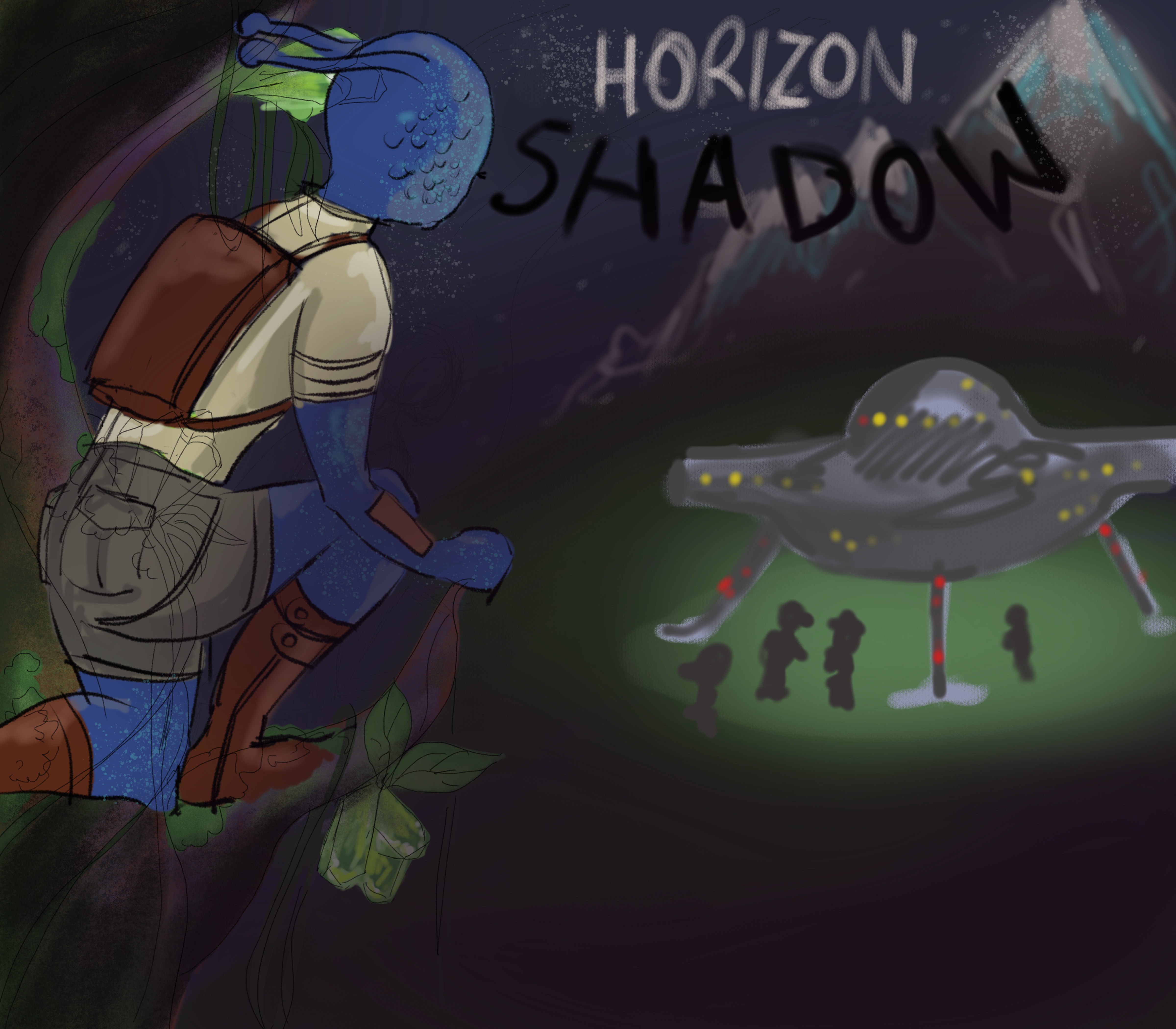
IDEA 1
This sketch was my very first idea for the cover. It shows Doug, the funky alien, watch in awe at the sight of a strange ship landing on the ground. A sense of mystery is evident right away: something terrible is going on. At first, I thought of it as a quite successful approach, but as I was working on the sketch adding more details to it, the story became too obvious. It seemed like I know everything and there’s no room for surprise. The ship landed, and it was pretty apparent where the story goes. This design implies one curse of action for the book, and I didn’t like that. I wanted something more open, something that would stir the imagination of the reader, make them wish they could read the book.
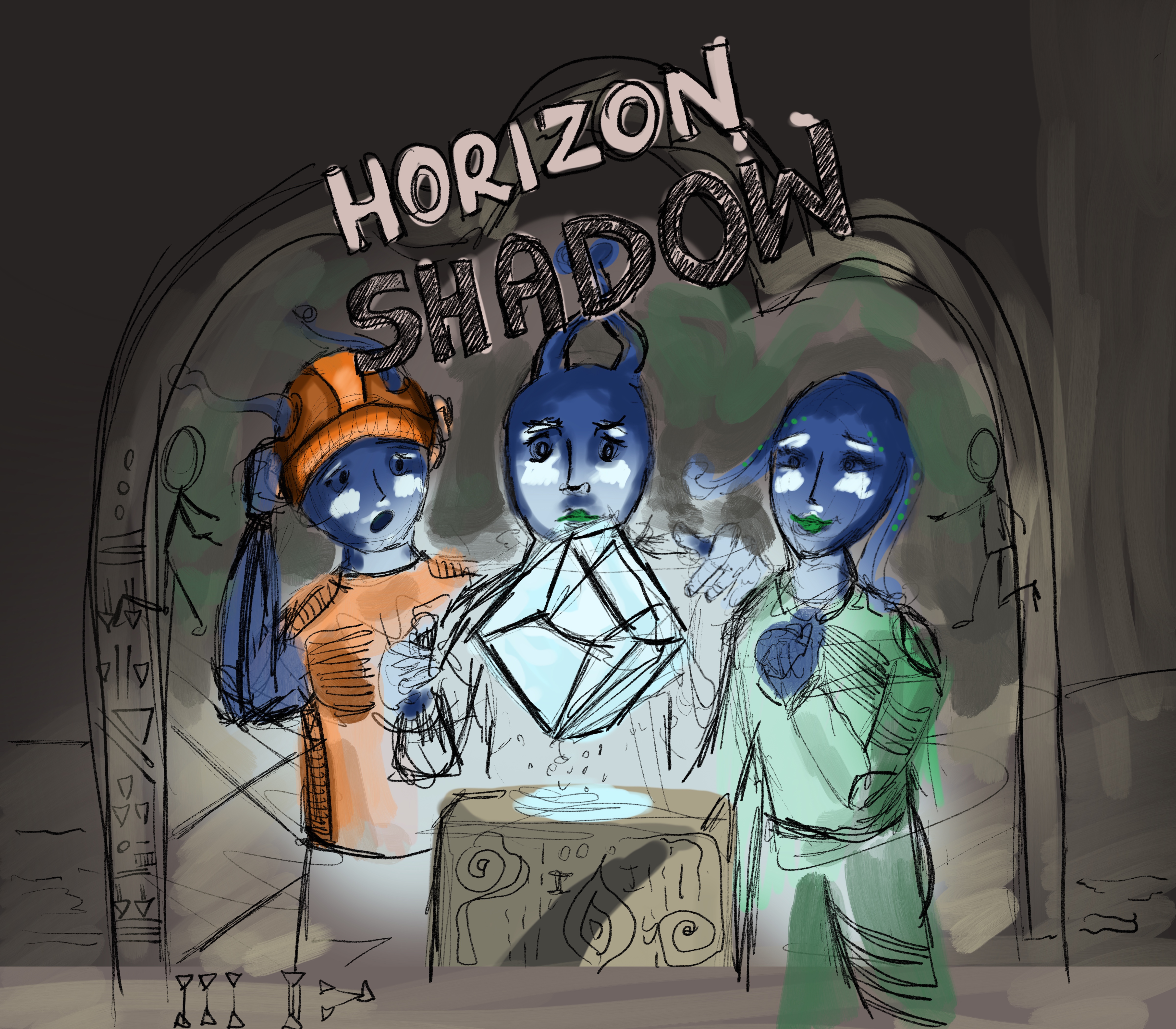
IDEA 2
To be able to do that, I was trying to come up with an idea far more engaging than just a spacecraft and a little blue dude hiding in the trees. I thought that the concept of the artifact was interesting. There were tons of possibilities in it. The heroes from the book could fight, be chased, travel through space and time – anything would be possible once they had the artifact. The best way to show that it is, in fact, an object with some mysterious powers, was to put it in the ancient looking temple, and have the main characters surround it, and ready to retrieve it. I had an idea for the animation right away as well, and it worked, because it was focused around the artifact and the main characters and that’s what I wanted. As I was working through this design, it seemed live. It wasn’t boring. It had a promise of many adventures. And from my
Instagram post, I can say, it created that promise for others as well.*
IDEA 3
This concept was a little bit forced on. I had to come up with a third idea, so I did. I didn’t entice me though. I think it would do great as an
illustration inside the book.
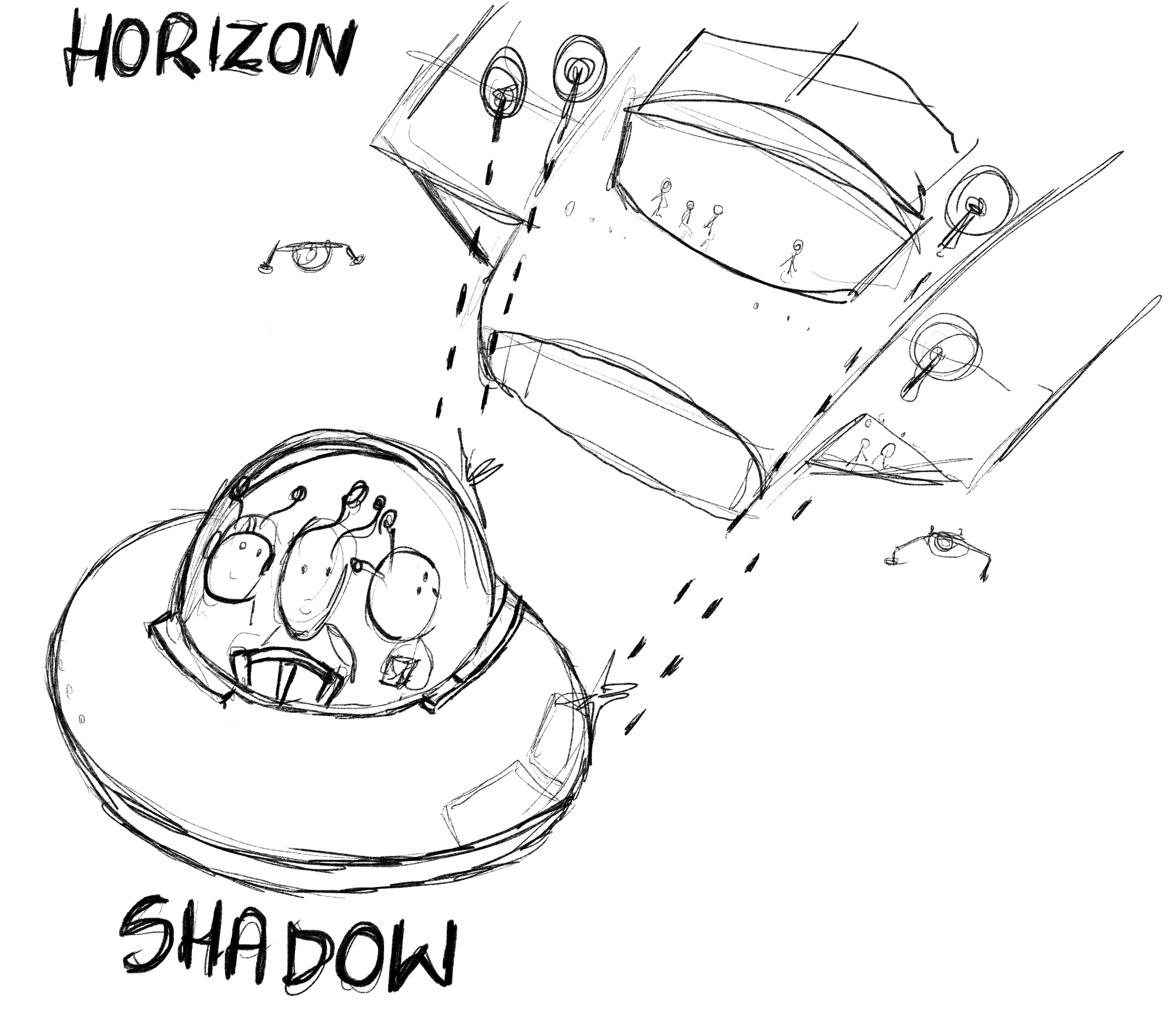
TIMELAPSE VIDEO
This 4.5 minutes video exposes exactly how many struggles I encountered drawing the main characters. I am pleased with the end result of my illustration, but because I’m not drawing very often, it was a challenging piece of work. I used iPad to draw and did all the finishing touches in Photoshop.
THE INSPIRATION BEHIND THE CHARACTER DESIGN
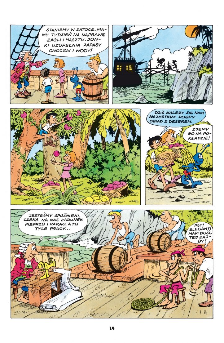
The inspiration behind the look of the heroes from the story is my favorite childhood character: Kleks. In this graphic novel, he is the artifact that possesses superpowers and takes two children, a boy and a girl, named Jonek and Jonka, on fantastic adventures through space and time.
THE CHALLENGES
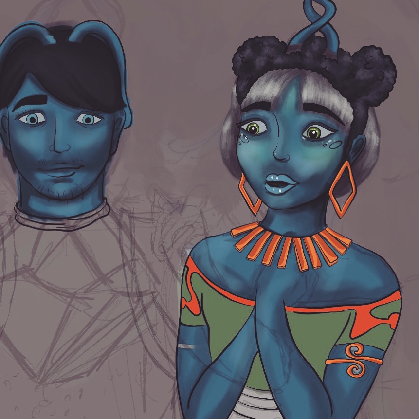
Coming up with the right shade of blue was a challenge. I really couldn’t decide which shade would work best. I think for the final I chose something close to my inspirational character. The problem was that when the color was too dark, the details were disappearing and it was too difficult to see all the details. At the same time, when the color was too light, the picture looked too cool and washed out.